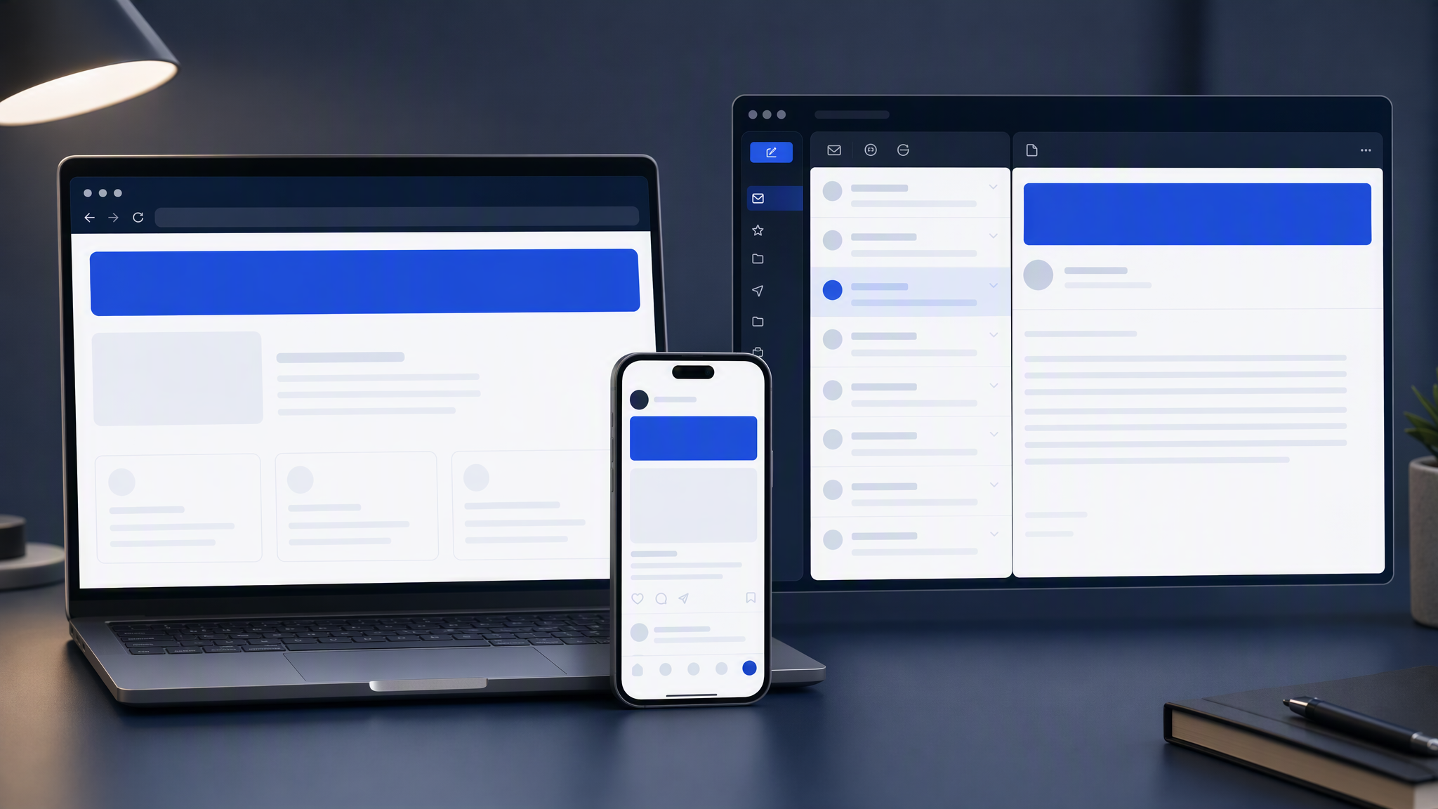
Your website looks like you. Instagram almost looks like you. The email header looks like a template you forgot to customise. Subscribers notice even when they cannot name the problem: the newsletter feels like a different company than the brand they clicked to follow.
Here is the answer-ready line: Treat email headers like social crops of one master look, not a separate redesign each week.
This guide is for founders and marketers who send weekly (or regular) emails and want the header to match the site and social without hiring a designer for every send. You will get why email drifts, master header rules, desktop and mobile sizes, how to reuse social masters, and a pre-send QA pass that takes minutes.
Why email drifts
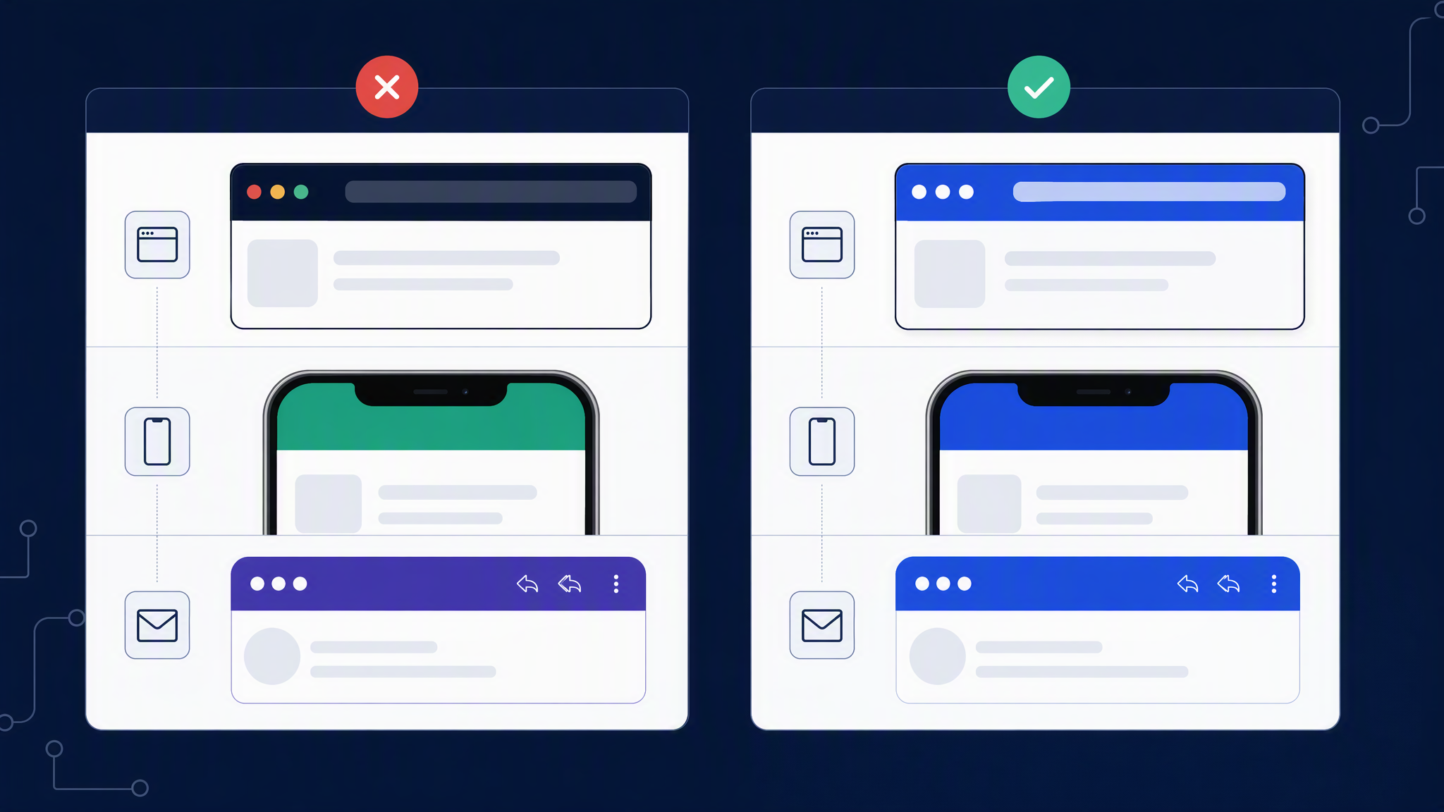
Email drifts for boring operational reasons, which is why it keeps happening.
Different owners. A freelancer or agency owns the site. Someone else schedules Instagram. A third person (or the same person on a Friday) builds the newsletter in Mailchimp, Klaviyo, HubSpot, or a drag-and-drop editor. Each tool has its own template gallery. Each gallery invents a look.
Different deadlines. Social wants frequent posts. Email wants a send time. When the newsletter is late, people grab a default header, a stock banner, or last quarter's seasonal stripe. The site did not change. The header did.
ESP templates fight your brand. Email builders reward modules that "look finished" out of the box: big centred logo, generic hero photo, buttons in a blue that is not yours. Accepting the default is faster than matching the homepage. Customers still open both.
Crop and compression lies. A beautiful social square becomes a wide email banner that chops the product. Dark text on a busy photo fails in dark-mode clients. Teams "fix" it with a new colour wash. That wash becomes a permanent second brand.
Campaign accents never end. A Black Friday red bar stays into January. A product launch gradient becomes the accidental newsletter identity. Without an end date, accents overwrite the master look.
AI and stock roulette. Fresh header every week from a new prompt or a new stock search guarantees lighting and palette drift. Volume without a master is how email stops matching Instagram and the homepage.
Recognition across site, social, and inbox is free trust. Drift spends it.
Master header rules
Stop designing an "email brand." Design one brand. Treat the email header as a crop and hierarchy change, not a personality transplant.
Lock these before the next send:
1. Same colours as the site. Primary, secondary, accent. Header backgrounds and button colours should be cousins of the homepage, not a new palette from the ESP theme.
2. Same logo behaviour. Which mark on which background, clear space, and no stretching to fill the banner. If the site uses a dark header with a light mark, do not suddenly drop a dark mark on a busy photo in email.
3. Same photo treatment. If social and the site use soft daylight product shots, the email hero should not look like a nightclub. One sentence of photo rules is enough.
4. One master visual per campaign. Create or choose the campaign hero once. Crop for social, site modules, and email. Do not rebuild lighting from scratch for the newsletter.
5. Type that survives inboxes. Prefer live text in the email body for offers and URLs when you can. If the header must include text, keep it large, few words, and high contrast. Tiny script that looked elegant on the website dies in mobile email.
6. Accents need owners and end dates. Sale stripes and launch devices are fine. Write when they die. After that date, return to the master look.
Write those rules on one page next to your brand kit. Anyone who builds the next email gets the page, not a vague "make it on brand."
Sizes desktop/mobile
Exact pixel needs vary by ESP and template. Agree defaults so nobody invents geometry under deadline. Use these as a practical starting point and adjust to your platform's docs.
Desktop-oriented header / hero
- Common content width sits around 600px wide for many classic email templates.
- Hero images are often designed at 1200px wide (2x) for sharpness, then displayed at template width.
- Height depends on your layout: a compact brand bar might be short; a campaign hero might be taller. Keep the focal point in the centre third so crops still work.
Mobile
- Most opens happen on phones. Assume the header will scale down to roughly 320-400px wide on screen.
- Put the logo and key subject in a centre-safe zone. Edges get squeezed; corners lose detail.
- Avoid critical text in the outer 10% of the frame. Mobile scaling and ESP padding are unforgiving.
- Check dark mode if your audience uses it: transparent PNGs and thin grey type often fail. Prefer solid brand colours tested on both light and dark clients when you can.
Safe-zone habits
- Logo clear space first, decoration second.
- One focal subject, not five competing icons.
- Buttons and primary CTAs usually live in the email body modules, not crushed into a busy header image.
- If you need a tall story-like crop for social and a wide email crop, start from a master that has room to crop both ways, or generate/design with both frames in mind from the start.
Save a one-page size cheat sheet beside the content calendar. Boring works.
Reuse from social masters
The fastest way to keep email matching Instagram and LinkedIn is to stop making email first.
Preferred workflow
- Approve a campaign master visual that already matches the website kit.
- Crop for social feed and stories as you usually would.
- Crop or lightly extend the same master for the email header width.
- Keep body modules simple: live text, your button style, product blocks that reuse the same photo family.
When social already shipped
- Reuse the winning social frame if it still has clear space for a wide crop.
- If the square is too tight, return to the master file (or regenerate from the same kit) instead of stretching the square into a banner.
- Do not download a compressed Instagram export as your email source. Use the original asset.
When the site is the source of truth
- Pull homepage or landing hero treatments into the email header family.
- Match background colour and logo placement even if the photo subject changes week to week.
What not to do
- Do not open the ESP template gallery and pick a "fresh look" because social felt repetitive. Repetition of the right look is recognition. Novelty of the wrong look is drift.
- Do not let AI invent a new header dialect every Tuesday. Prompt for subject and offer; keep identity in the kit.
Light Brandiseer fit: when you need matching packs across social and email, save the look once and generate the master, then crop. You still QA. You stop redesigning a separate newsletter brand each week.
Pre-send QA
Before every send, run a five-minute checklist. If you skip it, you will ship drift.
Open three tabs
- Homepage (or the landing page the email promotes).
- Latest Instagram or LinkedIn post with a visual.
- The email preview (desktop and mobile if your ESP offers both).
Ask
- Same colours, or did the ESP theme sneak in a new blue?
- Same logo file and placement habits?
- Same photo mood as social and site?
- Is the header a crop of this week's master, or a one-off invention?
- On mobile preview, is the subject still clear?
- Are temporary accents still within their end date?
- Do buttons and body modules clash with the header (different brand entirely)?
Fix or delay
- If the header fails two or more checks, replace it before send. A late email that matches beats an on-time email that looks like another company.
- Save the approved header crop into the shared campaign folder so next week's builder does not start from a template again.
Once a month, review the last four emails in a grid beside the site. Retire headers that drifted. Update the kit if the brand moved on purpose.
FAQ
Should every email use the exact same header?
No. Campaign subjects can change. Colours, logo behaviour, and photo treatment should stay stable. Think series, not identical stamp.
What if our ESP brand settings conflict with the site?
Set ESP brand colours and fonts to match the kit, or override template defaults per campaign. Do not accept the platform's blue because it is the default.
Do we need a designer each week?
No if the master and crops exist. Yes for a first proper kit and for high-stakes relaunches.
Can the logo alone carry recognition?
Sometimes, but photo mood and colour do more than people think. Logo-only headers on generic stock still feel rented.
One master, then crop
Email will always have different constraints than a homepage or an Instagram feed. It should not feel like a different company.
Treat email headers like social crops of one master look, not a separate redesign each week. Lock the rules, size for desktop and mobile, reuse social masters, and run a short pre-send QA. That is enough for most SMBs to look consistent in the inbox.