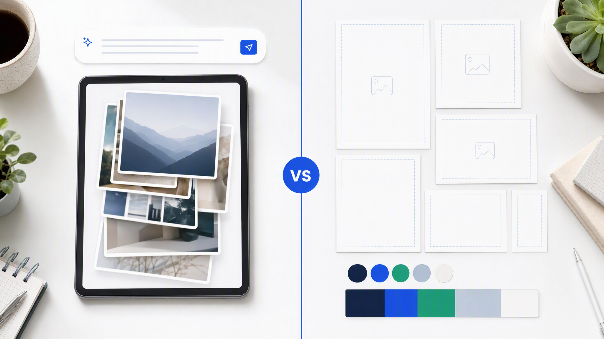
LinkedIn looks serious. Instagram looks lively. Somewhere between the two, your company starts to look like two different businesses.
Here is the answer-ready line: Pick one visual look, crop it for each channel, and check the feeds side by side every week.
This guide is for SMB owners and marketing leads who post on both LinkedIn and Instagram and want customers to recognise the same brand in three seconds, without hiring a full-time designer to babysit every resize.
Why the two feeds drift
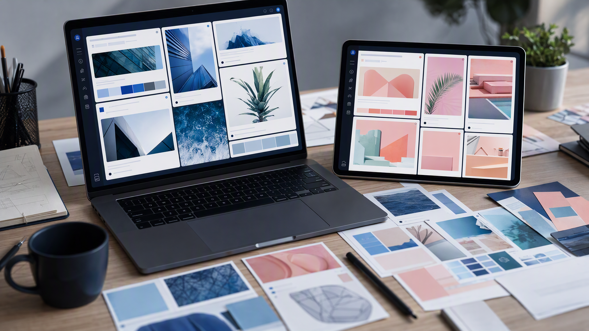
The platforms reward different moods. LinkedIn posts often go cooler, cleaner, and more "corporate." Instagram posts go warmer, busier, and more lifestyle. Left alone, two people (or the same person on two days) will "match the platform" until the only shared element is the logo, and sometimes not even that.
Cadence makes it worse. Instagram wants frequent visuals. LinkedIn wants thoughtful posts that still need a strong image. When you are late, you grab a different template, a different stock set, or a different AI prompt. Each shortcut invents a micro-dialect.
Crops lie. A square that looked balanced on Instagram feed becomes a LinkedIn landscape that chops the product. A Story vertical that felt fine on mobile looks empty or chaotic when you force it into a LinkedIn article header. Teams "fix" crops with last-minute colour washes and new fonts. That is how drift becomes policy.
Handoffs multiply the problem. A freelancer owns Instagram. An in-house marketer owns LinkedIn. Each has a favourite Canva folder. Neither reviews the other feed. Customers do. They may not articulate "brand inconsistency," but they feel "this does not look like the same company I followed last month."
AI volume turns a slow leak into a flood. Twenty generated options per channel sound productive. Without one master look, you get forty cousins who refuse a family photo.
One master look (not two platform brands)
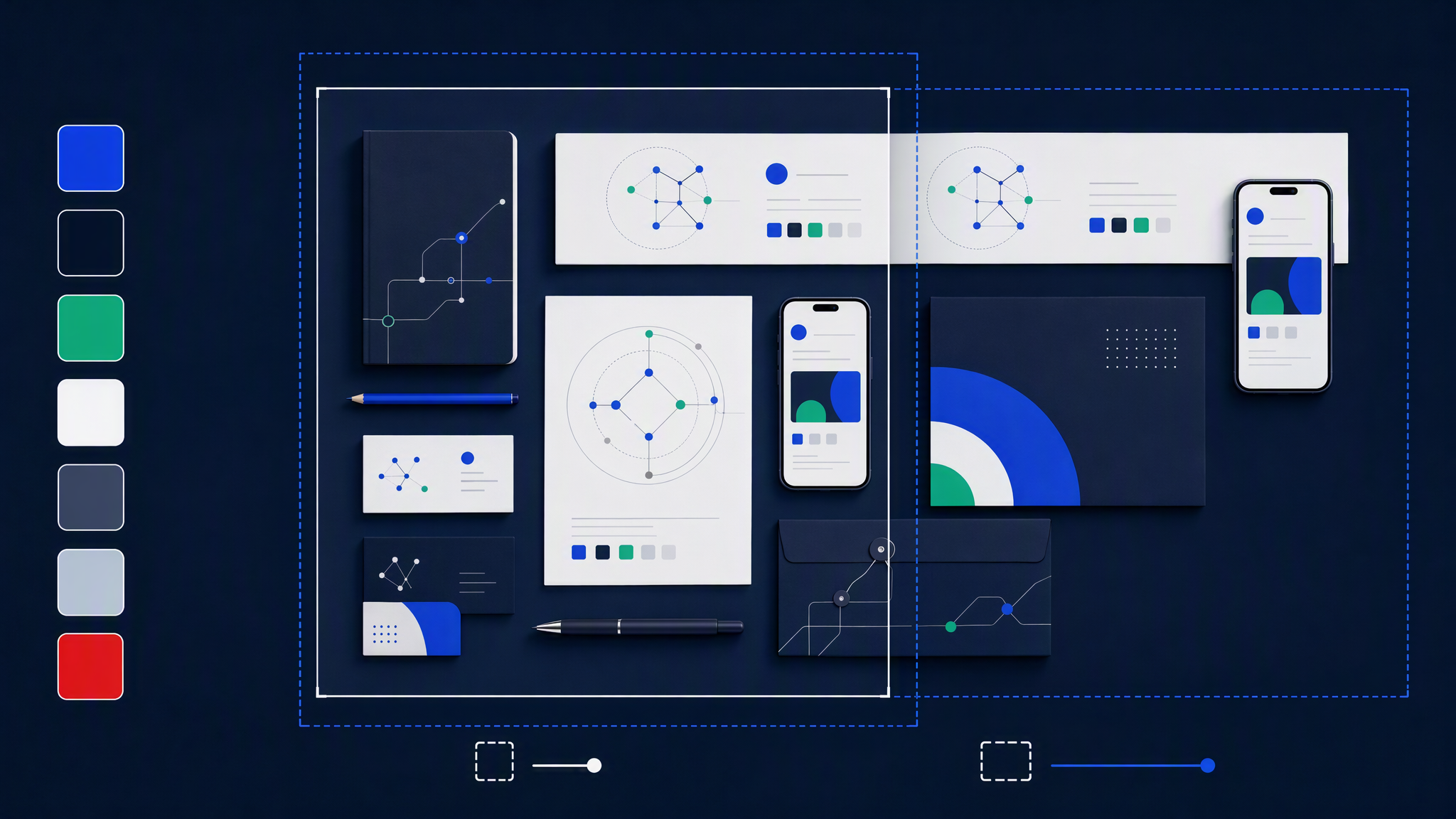
Stop designing "a LinkedIn brand" and "an Instagram brand." Design one brand. Treat channels as crops and hierarchy changes, not personality transplants.
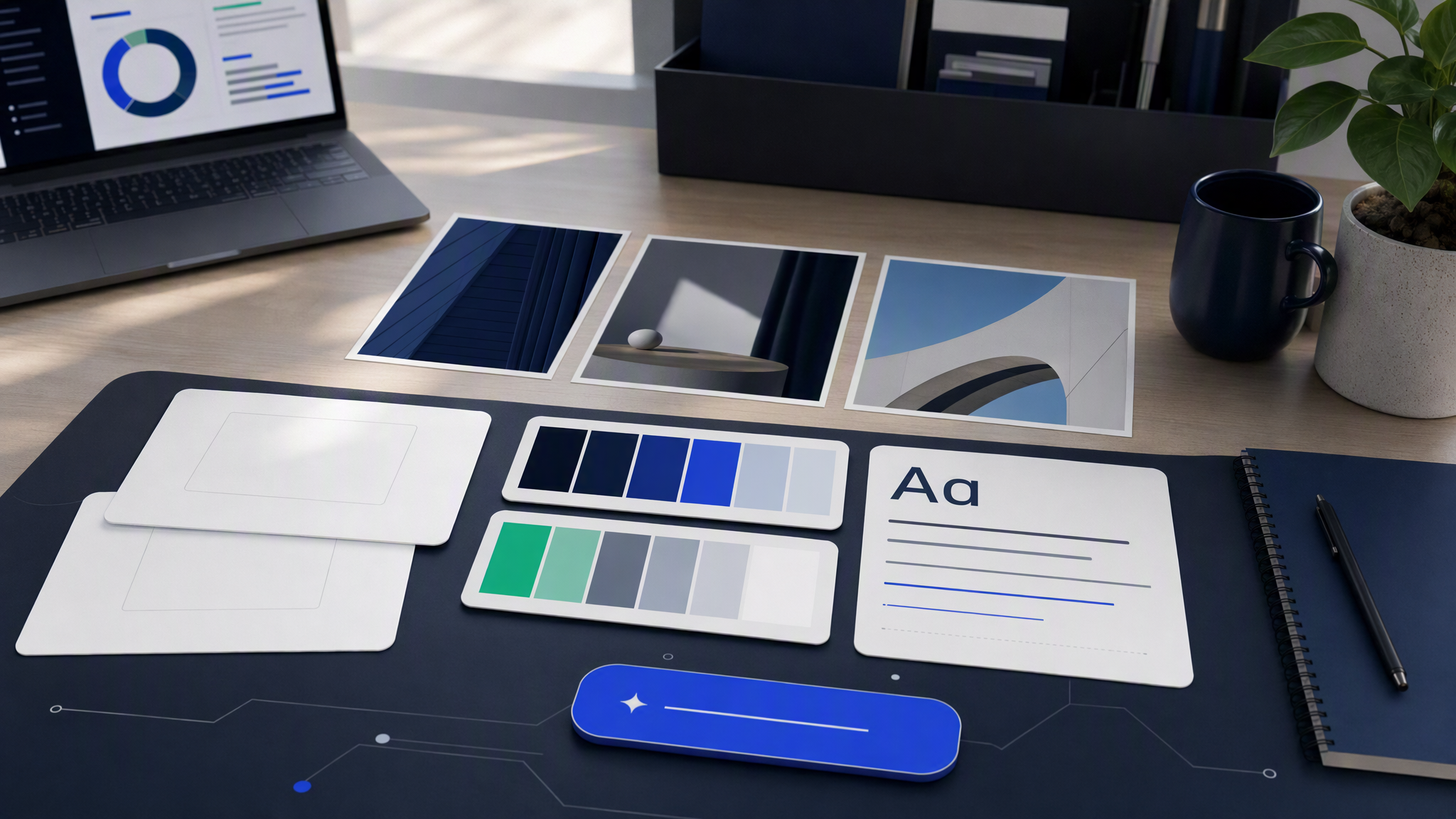
Lock these once:
- Colours with behaviour. Primary, secondary, accent. Where each usually sits (background, product, highlight). Combinations you ban even when they "pop."
- Logo rules. Which mark on which background. Clear space. When the icon alone is enough.
- Photo treatment. Lighting mood, background simplicity, how much lifestyle vs product. One sentence is enough if everyone follows it.
- Type mood. Headline vs body fonts (or "set type in the layout tool; keep AI type out of finals").
- Three to five reference images that mean "this is us" on both channels.
Write that kit on one page. Share it with anyone who posts. When someone asks for "more LinkedIn energy," translate that into composition and copy tone, not a new palette.
Campaign accents are allowed. A summer sale stripe or a product colour pop can live for a campaign if the base kit still holds. Temporary is fine. Permanent platform dialects are not.
Crop rules per channel
Same look, different frames. Agree the defaults so nobody invents geometry under deadline.
- Feed: 1:1 or 4:5. Keep the product or face in the centre-safe area. Leave room for caption contrast without stacking five text boxes.
- Stories / Reels covers: 9:16. Put the key subject in the middle third. Top and bottom get UI chrome; do not park the logo or offer only in unsafe edges.
- Carousels: Repeat the same background family and type style across slides. Changing "vibe" every card reads as a new brand mid-swipe.
- Feed image: Prefer 1.91:1 or a clean 1:1 if your toolset is simpler. Keep text large and sparse. LinkedIn users skim on desktop and mobile; tiny script dies.
- Document / carousel PDFs: Same colours and type as the feed. Do not suddenly switch to a deck theme from 2019.
- Banners and headers: Calm, high clear space, logo stable. These sit next to your name for months; they train recognition harder than a single post.
Shared rules for both
- Start from one master visual when you can: generate or design the hero scene once, then crop. Do not rebuild lighting from scratch per channel.
- Safe zones first, decoration second.
- If copy must change tone (professional vs casual), change words, not the entire visual system.
Print a one-page crop cheat sheet. Tape it next to the content calendar. Boring works.
Weekly QA grid
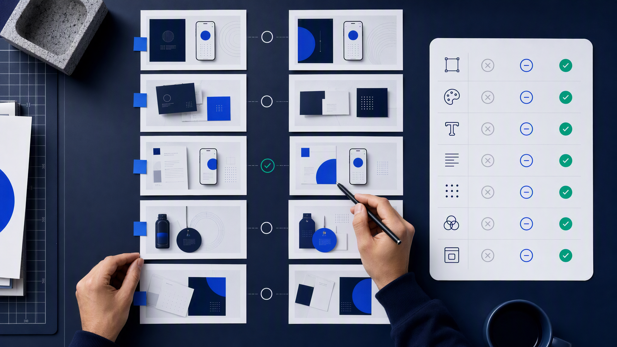
Consistency is a habit, not a slogan. Once a week, spend fifteen minutes on a side-by-side review.
Build the grid
- Open your last 7 days of Instagram feed posts (and one Story/Reel cover if you use them).
- Open your last 7 days of LinkedIn image posts.
- Put them in one board or folder: Instagram left, LinkedIn right, newest on top.
Ask only these questions
- Would a stranger guess these are the same company in three seconds?
- Do colours match, or did one channel invent a new accent?
- Is photo treatment consistent (warm vs cold, busy vs clean)?
- Are logos clear and stable, or stretched and relocated every time?
- Did crops cut the subject on one platform only?
- Are we repeating one template dialect so hard that the feed looks rented?
Act the same day
- Demote or archive the worst offenders if they are still easy to replace.
- Update the kit if a "mistake" was actually a better look you want to keep on purpose.
- Brief next week's makers with one line: "Match Tuesday's grid winners, not last month's experiment."
If you use freelancers, send the grid screenshot with the brief. Taste debates shrink when the evidence is visual.
Common mistakes
Matching the algorithm instead of the brand. "LinkedIn should look corporate" becomes grey everything. "Instagram should look fun" becomes confetti everything. Customers follow you across apps. Give them one company.
Different freelancers, no shared kit. Two talented people will still diverge. The kit is the contract.
Recreating instead of cropping. Rebuilding a scene from a new prompt or new stock set for each channel guarantees lighting drift. Master first, crop second.
Text as a personality transplant. Huge meme typography on Instagram and tiny elegant serif on LinkedIn can coexist only if colour, photo style, and logo behaviour still match. Often they do not. Align type rules or set type in one layout tool with shared styles.
Skipping the weekly grid. Drift is quiet. The grid makes it loud while you can still fix it cheaply.
Letting one-off "just this campaign" looks run forever. Campaign accents need an end date. Without one, the accent becomes the new accidental brand.
Letting AI invent a new dialect daily. Generate volume from a locked look. If the tool cannot hold your kit, reduce volume until process catches up, or use a workflow that applies your saved look on every asset.
A simple operating rhythm
Monday (20 minutes): Confirm the week's master visuals and which crops each channel needs.
Through the week: Produce from the kit. Crop, do not reinvent.
Friday (15 minutes): Run the QA grid. Note one fix for next week. Stop there. Do not redesign the brand on a Friday afternoon.
Monthly (30 minutes): Refresh references if the real brand evolved. Retire looks that no longer match the site or packaging.
This rhythm is small on purpose. SMB teams abandon heavy process. A short grid survives.
When Brandiseer helps
You can run this system in Canva, Google Pics, folders, and spreadsheets. Many teams do.
Brandiseer helps when the bottleneck is producing many LinkedIn and Instagram assets that should inherit the same look automatically. You save logo, colours, fonts, and references once. New posts start from that look. You still crop for each channel and run the weekly grid. You stop re-explaining "more like our brand" in every brief.
Stay manual when you post rarely and one person happily applies the kit by hand. Add a shared profile when volume, freelancers, or multiple tools make drift the default.
FAQ
Should LinkedIn and Instagram use the exact same image?
Often yes as a starting point: one master, two crops. Copy and slight hierarchy can differ. Lighting and palette should not.
What if our audiences are totally different?
Audience tone lives mostly in copy and topic. Visual recognition still helps both audiences trust they found the right company.
How strict should the grid be?
Strict on colours, logo, and photo treatment. Flexible on subject matter and campaign accents with an end date.
Do we need a designer?
Helpful for the first kit and tricky campaigns. Not required for weekly crops and the Friday grid if the kit is clear.
Same brand, two crops, one weekly check
LinkedIn and Instagram will always feel different in copy and context. They should not feel like unrelated companies in colour, photography, and logo behaviour.
Pick one visual look. Crop it for each channel. Check the feeds side by side every week. That is enough process for most SMBs to look intentional instead of accidental.