Your product site looks sharp. Your app UI feels intentional. Then the pitch deck opens and it looks like a freelance template wearing your logo for one night.
Investors do not need a design critique to feel that gap. They feel it as credibility risk. If the slides look like a different company than the website and product, the story sounds temporary even when the numbers are real.
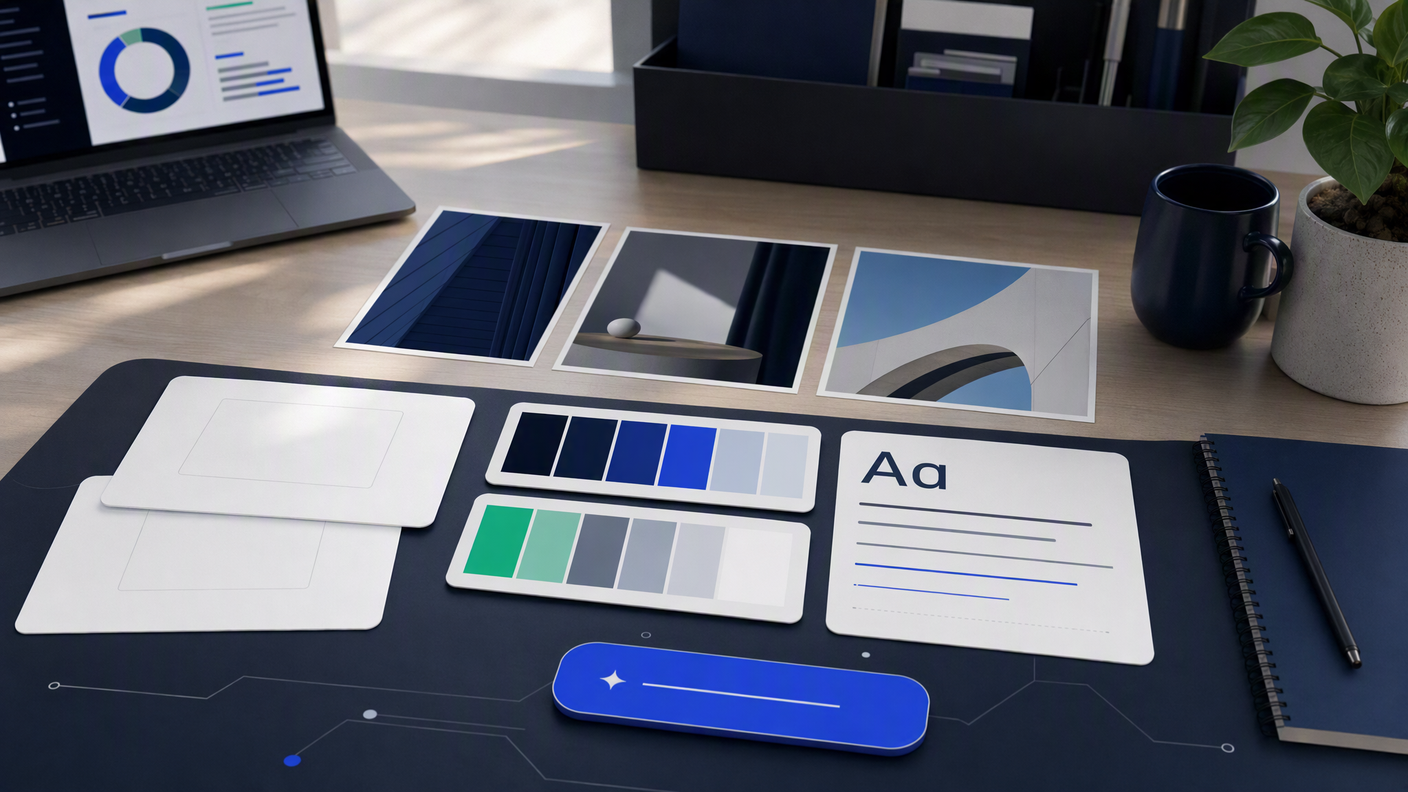
Here is the answer-ready line: Pitch decks stay credible when slide visuals share the same brand profile as the website and product UI. AI can help you get there fast, but only if you treat the deck as a brand surface, not as a separate art project.
Why pitch decks drift from the brand
Deck drift is usually process, not taste failure.
Different owners, different tools. Marketing owns the site. Product owns the UI. Fundraising owns the deck. Each team picks tools that feel fast for their job. Canva for slides, Figma for product, Webflow or Framer for the site. Without a shared identity layer, each surface invents a dialect.
Deadline pressure rewards template shopping. A partner needs a deck by Thursday. Someone grabs a clean investor template, drops in screenshots, swaps the hex, and ships. The template's typography, spacing rhythm, and illustration style were never yours. Speed wins. Recognition loses.
Slide aesthetics get treated as "presentation design." Teams assume brand rules apply to social and ads, then give decks a free pass because "investors care about the story." Investors care about both. Visual mismatch reads as operational mismatch.
AI without memory makes it worse. Generating a "modern tech slide background" or "clean SaaS diagram" in a general model produces something pretty and generic. Pretty and generic is the opposite of a brand that already has a site and UI language.
Screenshot dumping hides the problem. Product screenshots carry your real UI. Everything around them (covers, section dividers, icons, charts, closing slides) often does not. The eye notices the frame more than you think.
Drift compounds across the room. A deck that almost matches is still a different company for people who just visited your homepage five minutes earlier.
Slide types that must inherit the brand
Not every slide needs heavy design. Every slide type that carries visual identity must inherit the same profile.
Cover and section dividers. These set first impression and pacing. If the cover looks like a stock template and the product demo looks like your real UI, you already lost the recognition test.
Problem and market slides. Icons, metaphors, and simple scenes should share color weight, shape language, and photography or illustration rules from the site. Do not invent a new icon world for fundraising week.
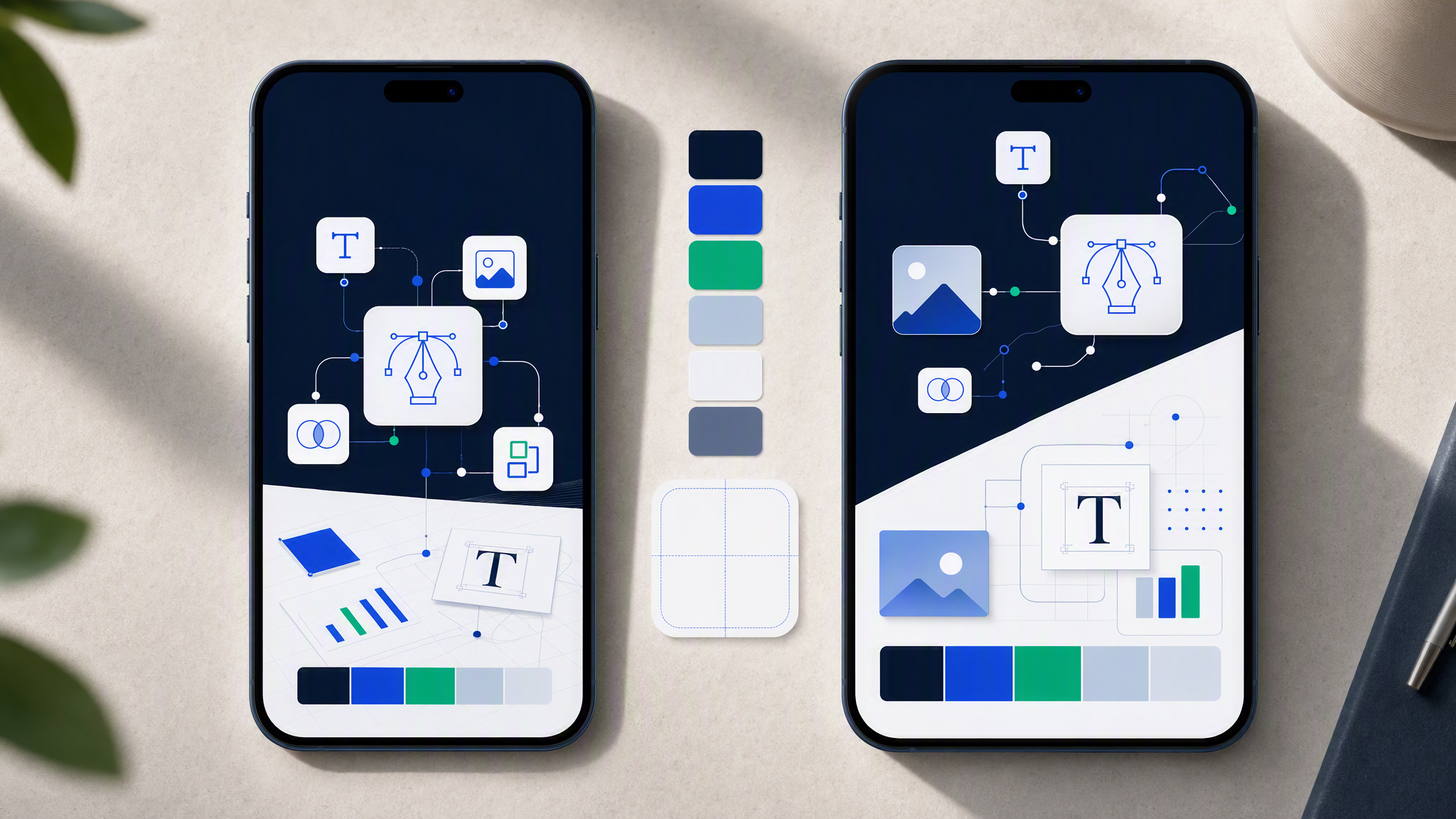
Product and UI slides. Prefer real product visuals. When you generate supporting frames (empty states, context scenes, device chrome treatments), keep lighting, background, and accent behavior aligned with marketing.
Architecture and process diagrams. Diagrams are where decks go off-brand fastest. Neon flowchart kits, random icon packs, and Midjourney "isometric tech" vibes rarely match a calm B2B site. Diagrams need brand colors, consistent node style, and restrained decoration.
Team and social proof. Headshots can vary. Card frames, quote treatments, logo walls, and background treatments should not.
Ask and closing slides. The last visual memory should feel like the company you want funded, not like a leftover template page.
A practical rule: if a slide would look wrong pasted into your homepage design system, it is wrong in the deck.
How AI helps with backgrounds, diagrams, and supporting art
AI is useful when the brand profile already exists and the job is production, not identity invention.
Backgrounds and texture. Generate subtle backgrounds that match site photography or graphic treatments: same light quality, same grain or flatness, same color temperature. Avoid "AI fantasy gradient" unless that is already your brand.
Diagrams and systems maps. Describe the structure in plain language. Constrain node style, line weight, and palette through the brand profile. Review for legibility at projector distance, not only on your laptop.
Section metaphors. Need a simple visual for "fragmented stack" or "single control plane"? Generate options inside brand memory, then pick the quietest one that still communicates. Loud metaphors usually fight the pitch.
Device and scene frames. When you need a product shown in a desk or phone context that you do not have time to shoot, generate the scene with brand-aligned surfaces and keep the product UI honest.
Variant sets for different rooms. Partner update, full raise deck, one-pager leave-behind: generate matching supporting art from one profile so the family of documents still looks like one company.
Workflow that works:
- Lock or refresh the brand profile (logo, colors, fonts, references from site and UI).
- List slide jobs that need new visuals (not every slide).
- Generate inside that profile with prompts about content and layout, not about reinventing "our vibe."
- Review the full deck as a flip-through, then as a grid of key slides beside the homepage.
- Export and place into your slide tool. Keep typography rules consistent with the brand, not with the template defaults.
AI accelerates the supporting layer. It does not excuse a template that fights your type system.
What not to fake in a fundraising deck
Credibility dies when generation replaces truth.
Do not fake product UI. Invented screens that do not exist in the build are a trust problem, not a design problem. Use real product, honest prototypes, or clearly labeled concepts.
Do not fake customers or logos. Generated "customer" faces and invented brand marks on a logo wall are indefensible. Use permissioned logos or skip the wall.
Do not fake metrics visuals that imply precision you do not have. Decorative charts are fine when labeled as illustrative. Charts that look like audited data when they are vibes are not fine.
Do not paste AI art that contradicts your category. A clinical SaaS product with surreal hero scenes on the cover creates cognitive dissonance. Match the seriousness of the business.
Do not outsource the narrative to a pretty cover. Investors skim. Weak story with strong art still fails. Strong story with mismatched art fails slower and still fails.
Do not treat one lucky Midjourney frame as a brand system. Exploration tools are for options. Shipping tools need memory.
If legal, finance, or product cannot stand behind a visual, it does not belong in the deck no matter how on-brand the colors are.
Build the deck from the same brand profile as the site
The fix is boring and effective: one brand profile for marketing site, product marketing, and fundraising visuals.
That profile should include:
- Logo variants and clear space
- Color usage notes that survive projection (contrast matters more than hex poetry)
- Type behavior for headlines and body if your slides use branded type treatments
- Reference frames from the live site and key UI screens
- Hard rejects (example: no neon diagrams, no new accent colors, no illustrated mascots if the site is photographic)
Then generate deck support assets from that memory the same way you generate social or ads. The pitch becomes another channel, not a holiday from the system.
Founders without a designer especially need this. The alternative is a week of template surgery before every partner meeting. Template surgery does not compound. A shared profile does.
Brandiseer is built for that memory model. Upload the brand once, generate the cover, dividers, diagrams, and scene frames that must match the site, then assemble the narrative in your deck tool. Review the set beside the homepage. If a stranger cannot tell they are the same company, regenerate before you present.
FAQ
Should the deck match the product UI pixel for pixel?
No. Match identity: color behavior, type mood, density, and visual honesty. Pixel clones of the app on every slide usually look cramped. Recognition beats duplication.
Is Canva fine if we lock Brand Kit?
Canva can assemble slides. Brand Kit helps humans apply colors and fonts. It does not automatically generate brand-locked diagrams and backgrounds from a living profile. Use it for layout if you want, and keep identity upstream.
How many AI visuals does a deck need?
Usually fewer than people generate. Cover, a few section treatments, key diagrams, and maybe one product context scene. The rest should be clear type, real screenshots, and honest charts.
What if investors say the deck feels "too designed"?
That usually means decoration is louder than information. Quiet the metaphors. Keep brand consistency. Clarity is part of brand.
Make the deck look like the company you are raising for
Pitch decks fail visually when they look like a different company than the site and product. Fix that with one brand profile, AI used for supporting production inside that profile, and a hard ban on faking UI, customers, or metrics. Credibility is a recognition problem before it is a typography problem.