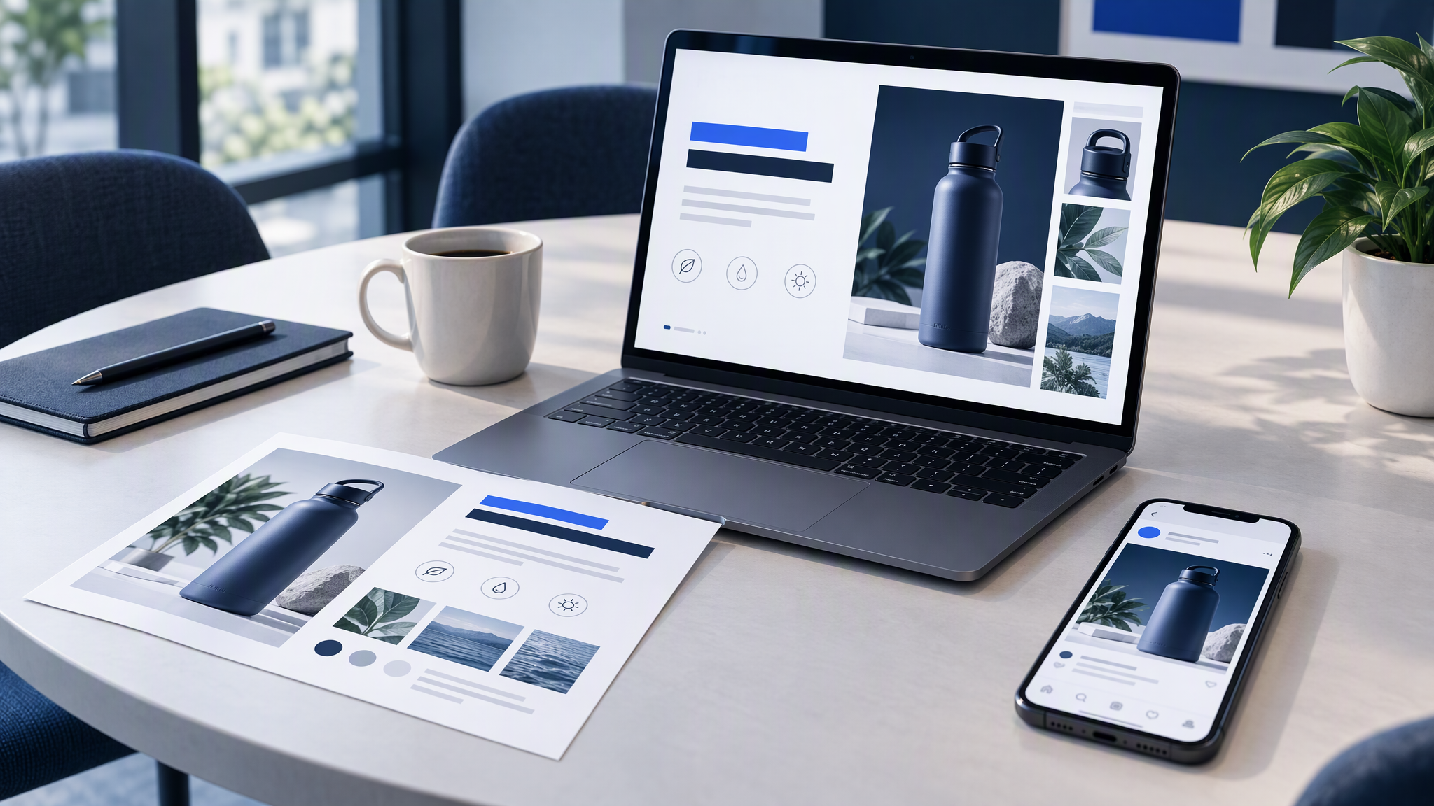
Investors see your website before or after the deck. When the two look like different companies, trust takes a quiet hit. The product story can be strong and still feel rented if the title slide wears a template palette your homepage never used.
Here is the answer-ready line: Build the deck from the same brand kit as your website. Do not invent a pitch-deck-only look.
This guide is for founders and marketing leads refreshing a deck before fundraising or a serious sales cycle. You will see why mismatch hurts, how to pull colour, type, and photo style from the live site, a slide checklist, how to use AI for slide art without restyling, and a simple QA that puts the homepage next to the title slide.
Why mismatch hurts

Decks drift for the same reason ads drift: convenience under deadline.
Templates win on Sunday night. Someone opens a popular Pitch or PowerPoint theme because it is "investor ready." The theme brings its own blues, gradients, and illustration style. Your site never consented.
The deck becomes a holiday from the brand. Marketing protects the website. The fundraising deck becomes a special project with its own moodboard. Investors meet two visual companies sharing one domain.
AI makes pretty cousins fast. A few generated diagrams and hero scenes look sharp alone. Lined up with the homepage, they introduce a lighting mood and accent colour you do not ship anywhere else.
Sales and fundraising multiply copies. Each partner meeting gets a tweaked export. Six weeks later nobody knows which file matches the live site.
Mismatch rarely tanks a round by itself. It taxes credibility. Recognition is part of how investors decide you are organised enough to scale. A deck that looks like another startup says the opposite without a single wrong number.
Related reading when the whole team needs one look, not only the deck: How to Share One Brand Look Across Your Marketing Team.
Pull colour, type, and photo style from the live site

Do not start in the template gallery. Start in the browser tab.
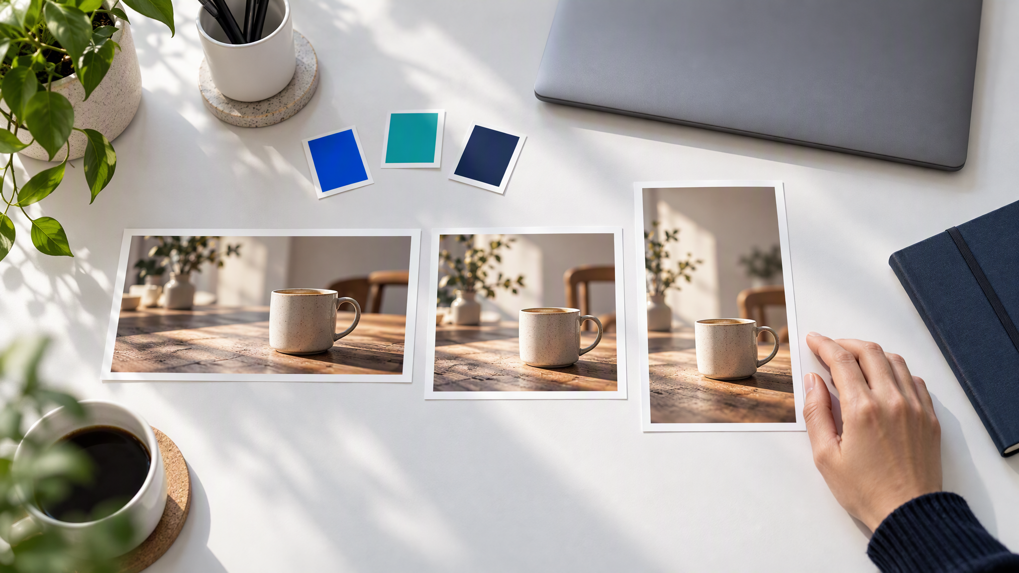
1. Screenshot the homepage and one key product or pricing page. Print or drop them on a board beside your draft title slide. This is the north star, not a moodboard from another industry.
2. Lift colours with behaviour. Note primary, secondary, and accent as they actually appear on the site: backgrounds, buttons, highlights. Write which combinations you refuse. Hex alone still produces rainbow decks.
3. Match type mood, not every pixel. If the site uses a calm sans for headlines, the deck should not suddenly shout with a display font from a template. If you cannot embed the exact webfonts, choose a close pair and stick to it for the whole file.
4. Copy photo treatment in one sentence. Soft daylight product shots? Flat UI screenshots? Human lifestyle with warm grade? Write the rule. New AI slide art must obey it.
5. Reuse real UI honesty. Prefer real product screens (cleaned) over fantasy dashboards. Fake UI is a faster trust kill than an off-blue.
6. Save that as the deck kit. Logo variants, colour behaviour, type rule, three to five reference frames from the site, and hard rejects (no neon diagrams if the site is quiet, no new mascot if you never use one). Same ingredients as your marketing kit because it is the same brand.
If the marketing kit is thin, fix that first: What to Put in Your Brand Kit Before You Use AI. A deck cannot match a website that has no clear look to match.
Slide-by-slide checklist

Run this once on the outline before you decorate.
Title / agenda
Same logo treatment and colour block language as the homepage header. No template hero that introduces a new world.
Problem and solution
Diagrams use your accent rules. Icons stay simple. Avoid clip-art styles your site never shows.
Product
Real screens or tightly cropped product photos in the site's photo treatment. No stock "laptop on marble" unless that is actually your site language.
Market and model
Charts should be clear first, branded second. Brand means colour and type discipline, not decorative chart junk.
Traction
Same. Numbers readable from the back of the room. Accent only for the series you want noticed.
Team
Photos match each other and match site portrait style. Mixed LinkedIn crops with five different lighting moods look accidental.
Ask / close
Return to the title system. Closing slides that invent a new gradient for drama undo the whole file.
Across every slide, ask: would this crop feel at home as a website section or a LinkedIn carousel from us? If not, restyle toward the site, not toward the template.
When you need the same campaign idea in many sizes later, the same discipline applies: How to Resize One Campaign Asset for Every Channel Without Drift.
AI slide art without restyle
AI is useful for covers, section dividers, simple diagrams, and scene frames. It is dangerous when each prompt invents a new brand.
Load the kit before you generate. Colours, logo rules, references from the live site. Do not paste a fresh style paragraph into every prompt and hope.
Keep prompts on the scene. "Abstract network map for market slide, lots of negative space for a headline" is a job. "Make it fintech purple glassmorphism" is a restyle request if your site is not that.
Generate fewer images than you think. Cover, a couple of section treatments, key diagrams, maybe one product context scene. The rest should be clear type, real screenshots, and honest charts.
Ban decorative AI type inside images. Set headlines in the deck tool with your real fonts. AI lettering almost always fights the system.
Review beside the homepage, not beside other AI samples. Winning against Midjourney explore is irrelevant. Winning against your own URL is the job.
For a deeper pass on AI inside decks, see How to Keep Pitch Deck Slides On-Brand with AI.
Brandiseer fits when you already save a brand kit for ads and social and want deck support assets from the same look. Upload once. Generate the cover and diagrams from that kit. Assemble narrative in Pitch, Keynote, or PowerPoint. You still write the story. You stop inventing a pitch-only visual dialect.
QA: homepage next to title slide
Before you send the PDF, do a five-minute visual QA.
- Open the live homepage and the title slide side by side on one screen.
- Check logo clarity, colour blocks, type mood, and photo treatment.
- Flip to the product slide and a product page screenshot. Same honesty test.
- Flip to three random middle slides. Do they still feel like the same company?
- Ask one teammate who did not build the deck: "Same brand as the site?" If they hesitate, fix before the meeting.
Optional stronger test: export three slides to images and drop them in a folder with three website screenshots. Sort the folder randomly. You should still see one brand.
If fundraising is busy, schedule this QA the day before the first send, not in the Uber to the meeting.
FAQ
Should every slide look like a webpage?
No. Match identity: colour behaviour, type mood, density, and visual honesty. Pixel-cloning the site on every slide usually looks cramped. Recognition beats duplication.
Is a popular investor template okay if we recolour it?
Recolouring helps. Keeping the template's illustration style, icon set, and photo mood usually still reads as rented. Prefer your kit over the theme's personality.
How many AI visuals belong in a deck?
Usually fewer than people generate. Prioritise clarity. Extra metaphors rarely raise conviction.
What if our website is mid-redesign?
Pick the look you are committing to for the next quarter (live or about-to-ship) and lock the deck to that. Do not mix old site blues with new site greens "for now."
One brand in the browser and the boardroom
Investors notice when the deck looks like another company. Fix it with the same kit you use for the website: colours, type, photo style, real product honesty, and AI that paints scenes instead of reinventing identity.
Build the deck from the same brand kit as your website. Do not invent a pitch-deck-only look. When Brandiseer already holds that kit for ads and social, pull deck art from it too, then QA the title slide against the homepage before you hit send.