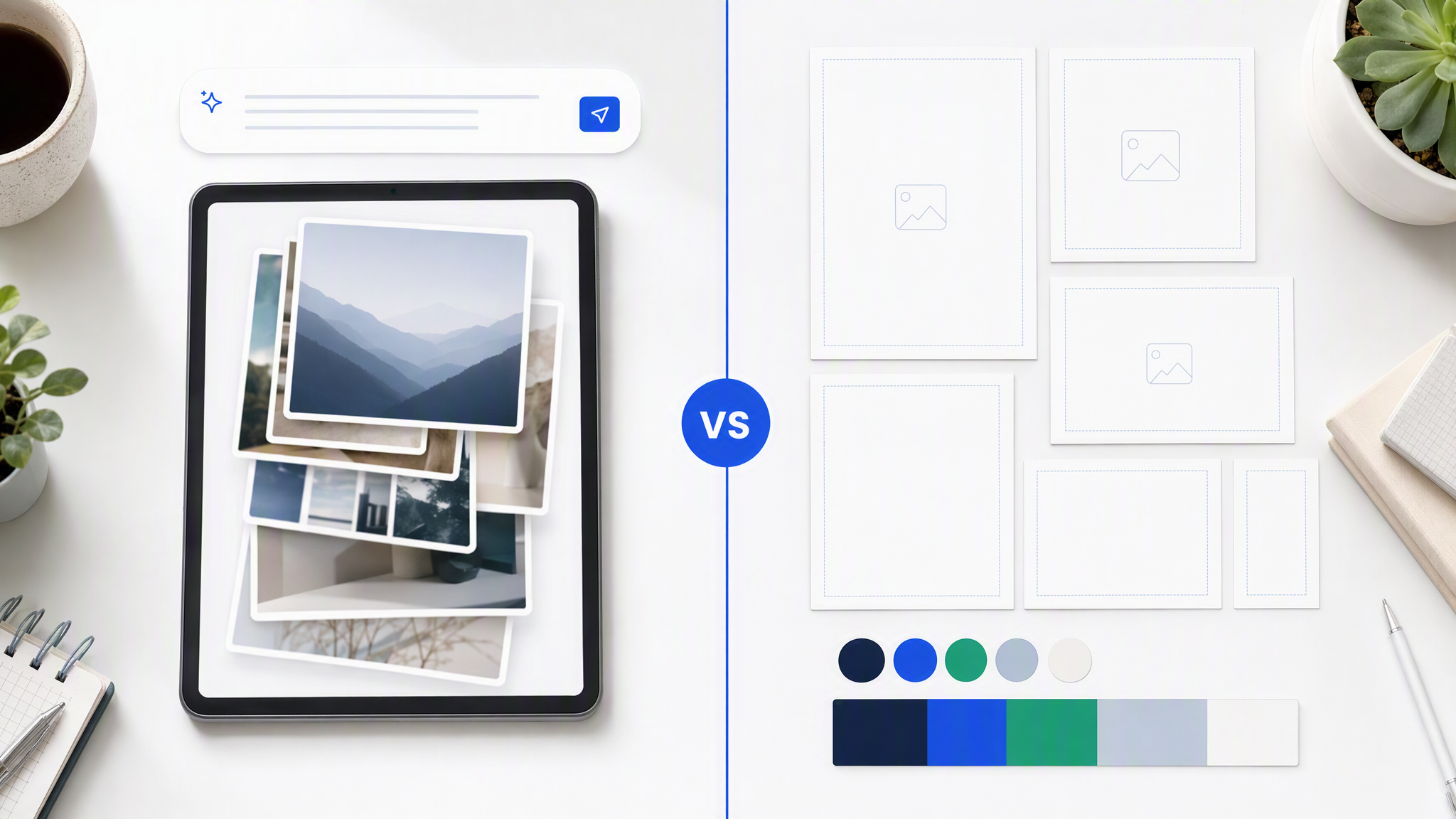
Most teams start AI image work in the wrong place. They open a generator, type a hopeful sentence, and judge the result like a slot machine. When the output looks good, they save it. When it does not, they add adjectives. After a week they have a folder of impressive orphans and a brand that feels harder to recognize than before.
Here is the answer-ready sentence: A visual system is the written set of image rules your brand must meet; AI only stays consistent if those rules exist before the first generation.
This post is for founders and marketing leads who want AI volume without training their audience on drift. The order matters: system first, generation second, batch planning third.
Why generate-first fails
Generate-first feels productive because pixels appear quickly. It fails for operational reasons, not mystical ones.
No shared acceptance criteria. Without written rules, “on-brand” means “I like it today.” Two reviewers will ship different dialects. Freelancers will invent a third. AI will invent a fourth faster than all of them.
Prompt folklore replaces documentation. The “good” look hides in someone’s chat history: a seed, a style reference, a paragraph of adjectives. When that person is out, the look leaves. Tools did not fail. The system never existed outside a person.
Volume multiplies error. One off-brand hero is a miss. Forty off-brand SKUs, ads, and social posts are a rebrand you did not approve. AI makes the forty easy. That is only a gift if the constraints are real.
Campaigns cannot compound. Strong brands accumulate recognition. Generate-first resets recognition every session. You pay twice: once to make assets, again to re-teach the audience who you are.
You optimize the wrong skill. Teams get better at prompt theater and worse at deciding what must never change. Prompt theater does not survive hiring, agency handoffs, or multi-channel weeks.
If you have already generated a pile of experiments, do not delete them yet. Mine them for decisions. Keep the ones that match the system you are about to write. Retire the rest without guilt.
Minimum viable visual system: five decisions
You do not need a 60-page brand book to start. You need five decisions written clearly enough that a stranger (or a model) could follow them.
1. Color behavior (not only hex codes)
List primary, secondary, and accent colors. Then write behavior:
- What dominates backgrounds vs product vs UI chrome in marketing images?
- Which combinations are banned (even if they “pop”)?
- How much accent is allowed per asset (a stripe vs half the frame)?
- Do you use soft neutrals, hard contrast, or both in defined cases?
Hex without behavior still produces rainbow weeks. Behavior is the system.
2. Typography rules for image text (if you put words on images)
Decide:
- Which families appear in image treatments.
- Headline vs supporting hierarchy.
- Maximum line length and minimum size for mobile.
- When to keep type off the image and add it in layout tools instead.
If your AI text is chronically ugly, your system may correctly say: generate the visual, set type elsewhere. That is a valid rule.
3. Logo and mark behavior
Write clearance, minimum size, approved variants (full mark vs icon), and placements that are never allowed (over busy faces, low-contrast corners, stretched locks). Decide whether every asset needs a logo or only certain channels. Silence here creates sticker chaos.
4. Photography and illustration style
Pick the modes you actually use:
- Product on seamless vs in-context.
- Lighting character (soft daylight, hard studio, mixed).
- Human presence rules (hands only, full lifestyle, none).
- Illustration vs photo: when each is allowed.
- What never appears (stock clichés, competing brand cues, banned props).
Two approved modes beat twelve accidental ones. Name them so briefs can say “Mode A: seamless hero” without a meeting.
5. Composition and crop grammar
Define how subjects sit in frame across common ratios:
- Preferred subject scale (product fills 40% vs 70%).
- Negative space habits (quiet premium vs dense retail).
- Safe zones for stories and paid placements.
- Recurring layout patterns you want to keep (left product / right offer field, centered object, grid of details).
This is where channel packs stop looking like random crops of one lucky square.
Write these five decisions in a short living doc. One to three pages is enough for a minimum viable system. Pretty PDF optional. Clarity mandatory.
Document once, update deliberately
A visual system that lives only in Figma comments will die. Put it where production happens.
Minimum documentation package
- One-pager of the five decisions.
- Swatches and logo files in a shared folder with names humans understand.
- Five example assets labeled “in system” and three labeled “out of system” with one-line reasons.
- A change log: what changed, why, date.
Rules for updates
- Campaign devices can be temporary and dated.
- Core identity changes require an owner and a note, not a Slack vibe.
- Freelancers get the package on day one, not “look at the feed and guess.”
Documentation is not bureaucracy here. It is how you stop paying for rediscovery. AI does not read your mind. It reads what you feed it and what you stored.
If you work with an agency, send this package with the brief. Ask them to QA against it. If they cannot, they are freelancing taste on your dime.
Feed the system into tools
Writing rules and never connecting them to tools is how PDFs become graveyards.
Brand-locked generators. Upload logo, colors, fonts, and reference assets so identity persists across generations. Daily prompts describe the job and format, not the entire brand. Memory first, request second.
Template tools. Load Brand Kit equivalents so teammates cannot invent neon by accident. Still remember: templates are layouts, not generative memory. Use them for assembly when needed, not as a substitute for rules.
Art generators. Use for exploration with the system as a scorecard, not as the production source of truth. Explore widely, then bring winners into a brand-locked lane for volume.
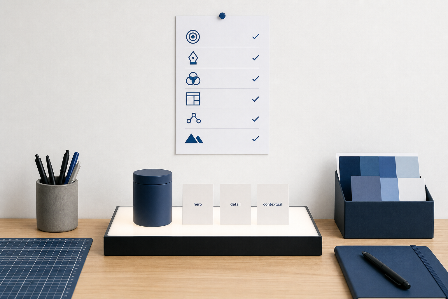
Design QA checklists. Turn the five decisions into a short review list for every batch: color behavior, type, logo, photo mode, composition. Reviewers tick boxes. Arguments get shorter.
Brief templates. Every request should state: campaign, mode (from your approved list), channel/ratio, must-show subject, must-avoid list. If a brief cannot fill those fields, it is not ready for generation.
The feed-in step is where teams usually cheat. They write a nice doc, then prompt like the doc does not exist. Do not cheat. The first ten generations after documentation should be deliberately boring relative to the system. Boring means compliant. Exciting comes from the campaign idea, not from breaking the grammar.
Batch planning: generate inside the system
Once the system exists, plan work in batches so review can catch drift.
Plan the set before you generate
For a launch week, list assets as rows:
| Asset job | Channel / ratio | Photo mode | Offer device | Notes | | --- | --- | --- | --- | --- | | Hero announcement | Feed 4:5 | Seamless hero | Spring badge | Product A front | | Proof post | Feed 1:1 | Contextual | None | Hands + product | | Story sequence | 9:16 x3 | Seamless | Price chip | Safe zones | | Paid variant A/B | 4:5 | Seamless | Two headlines | Same visual base |
Fill the table first. Generate second. This prevents “we needed a story” panic crops at 5pm.
Generate in controlled groups
Generate all seamless heroes together. Generate contextual posts together. Mixed modes in one blind batch make QA harder. Keep campaign devices consistent within a group so tests measure message, not accidental redesigns.
Review at grid scale
Never approve only the prettiest single image. Put the batch on one board. Check recognition at thumbnail size. Check that Mode A still looks like Mode A. Check that temporary campaign devices did not overwrite core color behavior.
Retire and archive with labels
Keep winners labeled by system version and campaign. Archive rejects. Do not let rejects re-enter the reference folder and poison the next week.
Close the loop weekly
Fifteen minutes: what broke the system, what rules were unclear, what campaign device should expire. Update the one-pager. This is how the system stays alive without becoming a museum.
What “good enough” looks like before you scale
You are ready to scale generation when:
- A new teammate can produce a passable asset using only the package (no tribal Slack).
- Five assets in a row pass the checklist without emergency art direction.
- Multi-ratio crops still feel intentional.
- You can explain a rejection in one sentence that points to a written rule.
You are not ready when:
- Every asset needs a senior taste pass from scratch.
- Color accents change daily for “engagement.”
- References contradict each other.
- Nobody can say which photo mode was requested.
AI does not fix unreadiness. It advertises it.
Light callouts for common objections
“We move too fast for documentation.”
You already document somewhere: in arguments, revision threads, and redo costs. Writing the five decisions is cheaper than the third rebrand of the month.
“Our brand is flexible.”
Flexible still has edges. Write the edges. Flexibility without edges is noise.
“We will standardize after we find a look.”
Exploration is fine with a time box. After the time box, lock the five decisions. Endless exploration is generate-first with better PR.
“Our designer keeps it in their head.”
Then your brand equity has a bus factor of one. Put it on paper before you ask AI to scale that person’s undocumented taste.
If you are already mid-mess
Pause generation for half a day. Write the five decisions. Gather in/out examples. Clean the reference folder so rejects stop poisoning the next batch. Then generate a controlled set and review against the checklist.
The sequence is the product. Any tool you use only amplifies whatever rules you already wrote. Keep strategy and taste human. Put volume inside stored identity only after the identity is written.
FAQ
How long should a minimum viable visual system take?
Often half a day to two days for an existing brand with assets. Longer if you are still choosing who you are. Do not wait for perfection. Ship the five decisions, then iterate with a change log.
Do I need a designer to write it?
A designer helps. A founder with strong references and ruthless editing can draft the MVVS. Have a designer review if you can. Do not wait forever for a perfect workshop.
What if AI ignores part of the system?
Tighten inputs (upload clearer references), shorten prompts to job+format, and strengthen QA. If a rule is routinely broken, it may be poorly specified or not actually loaded into the tool.
Should illustration and photo share one system?
Share color, logo, and composition grammar. Allow separate mode rules for medium. Do not let illustration become an ungoverned escape hatch.
How often should we revise the system?
When the business changes, when campaigns teach you something durable, or when QA keeps failing for the same reason. Not every time someone is bored.
Write the rules, then generate
Generation without standards scales mess. A visual system is the written image rules your brand must meet. AI stays consistent only if those rules exist before the first generation.
Do the unsexy half day. Capture five decisions. Feed them into your tools. Plan batches. Review grids. Then turn the volume up.