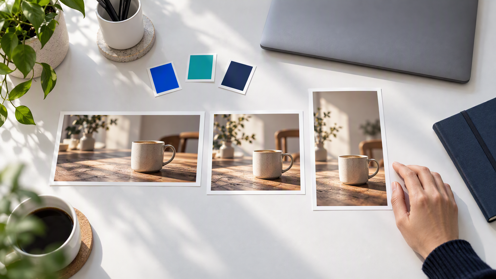
To make banner ads with your brand kit, save your colours, logo and reference images once, then make one clean image per shape from that same setup. Keep text and the logo as separate files, as Google advises for responsive display ads, so every size still looks like you.
This is for a small business owner, or the one person who does the marketing, setting up Google display or social banner ads for the Christmas and January sales without a designer. The same message in several shapes is where colours and style drift. The plan below sets the brand up once, in about an hour, then makes a clean image for each shape.
What banner maker uses my brand kit for every size?
Most design and AI image tools can hold a brand kit; what matters is that you set it up once and start every banner from it. If you run Google display ads, make clean images in three shapes (horizontal, square and vertical) and upload your logo and headlines separately, as Google advises. If you mainly need eye-catching scenes in your colours and style, an AI image tool that saves your brand, such as Brandiseer, fits. If you need exact text layouts in dozens of sizes, use a template editor for the final step.
How those kits compare, when you are choosing one, is in Brand Kit Tools Compared for Small Teams. This post is the banner job: which sizes to make first, and how to keep every shape looking like the same shop.
Why banner sets drift off brand
A set drifts when each shape is a new design. The wide banner, the square and the tall one get made on different days, so the light changes. A warm brown gets re-picked as a brighter orange because one frame looked dull. A headline that fits the wide strip has to shrink on the tall one, and the logo slides into whichever corner has room. A product on a table becomes a product in a new room because the tall crop felt empty.
Start from one saved brand and one scene. Change the shape. Leave the shop alone.
The banner sizes worth making first
If you run Google display ads, make three shapes first. Social banners can use the same three scenes.
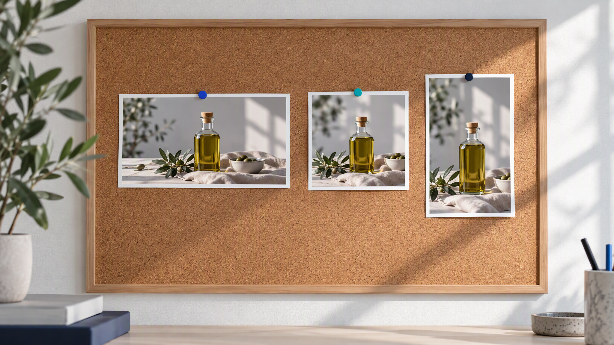
As of November 2026, Google's Best practices guide for responsive display ads recommends these image sizes. The figures in the table are from that page, as of November 2026.
| Shape | Recommended size | Minimum size | Note |
|---|---|---|---|
| Horizontal | 1200 x 628 | 600 x 314 | 1.91:1 |
| Square | 1200 x 1200 | 300 x 300 | 1:1 |
| Vertical | 900 x 1600 | 600 x 1067 | 9:16 |
As of November 2026, the same page says you can upload up to 15 images in each ratio, lists 5 to 10 images per aspect ratio, and sets a maximum file size of 5120 KB. Google says uploaded images may be resized to fit a particular ad size, so make the recommended file and expect smaller placements. Keep edges square and borders transparent, so the image can run to the full shape.
As of November 2026, Google says Display campaigns are moving to Demand Gen: from June 2026, eligible advertisers can begin voluntarily moving existing campaigns, and later new campaigns can only be created in Demand Gen. Check the current image specs in your account before you export.
Keep text and logo off the image
The image carries the look. The logo file and the headline carry the message.
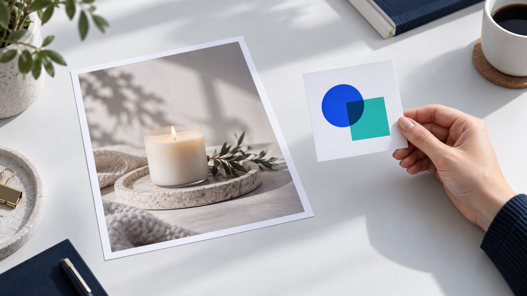
As of November 2026, Google says not to overlay a logo on the image. The logo is its own asset, and a logo painted onto the picture can repeat once Google combines the assets. A logo already in the photograph, such as a sign on the shop, is allowed. A mark dropped into the corner is the case to avoid.
Google also says to avoid text laid on top of the image. As of November 2026, overlaid text can repeat your headline, and it can turn unreadable in a smaller ad. Text naturally in the photo, such as a real sign, is allowed. A headline you typed onto the banner is the line to leave in the ad account.
You then make one clean scene, in your colours and your light, and upload the logo and the headlines beside it. If a shape cannot hold the offer, shorten the headline. Leave the picture as the scene.
Set up your brand once in Brandiseer, then make each shape
Set aside about an hour. The hour is one setup, then three shapes.
Upload your colours, logo, and references. Save the colours you already use, the logo as its own file, and a few photos that already look like the shop. This post adds no price. It does not claim that Brandiseer writes the headline onto the banner, places the logo on the image, exports the pixel sizes in the table, or offers 1.91:1 or any fixed list of ratios.
Pick the brand and the aspect ratio on the Dashboard before Generate. As of November 2026, the note Prompt-first Dashboard to Chat creation workspace, shipped on 24 August 2026, says you choose the aspect ratio and the brand on the Dashboard, and Generate opens Chat with that setup. The last brand you used is remembered, so read the name before each shape. Repeat the same scene for horizontal, square and vertical. If the file must land on 1200 x 628, 1200 x 1200 or 900 x 1600, set those pixels in the ad account or a template editor.
Start from a rough idea, then Enhance. As of November 2026, the note Brand-aware Prompt Enhancement, shipped on 22 August 2026, says Enhance turns a rough idea into a sharper image prompt that already respects the brand. Write the scene in plain words, use Enhance, and keep that prompt for each shape.
Use Ready Format if a version also goes to print. As of November 2026, the note Ready Format for printable, full-bleed output, shipped on 20 August 2026, says Ready Format aims at printable full-bleed results, and that you judge the bleed on the file you download. The display ads still keep text and the logo off the image.
Planning the set from the start is this post. Resizing a banner you have already finished is a different job, in How to Resize One Campaign Asset for Every Channel Without Drift.
Check the set side by side before it goes live
Line every size up on one screen before anything is scheduled.
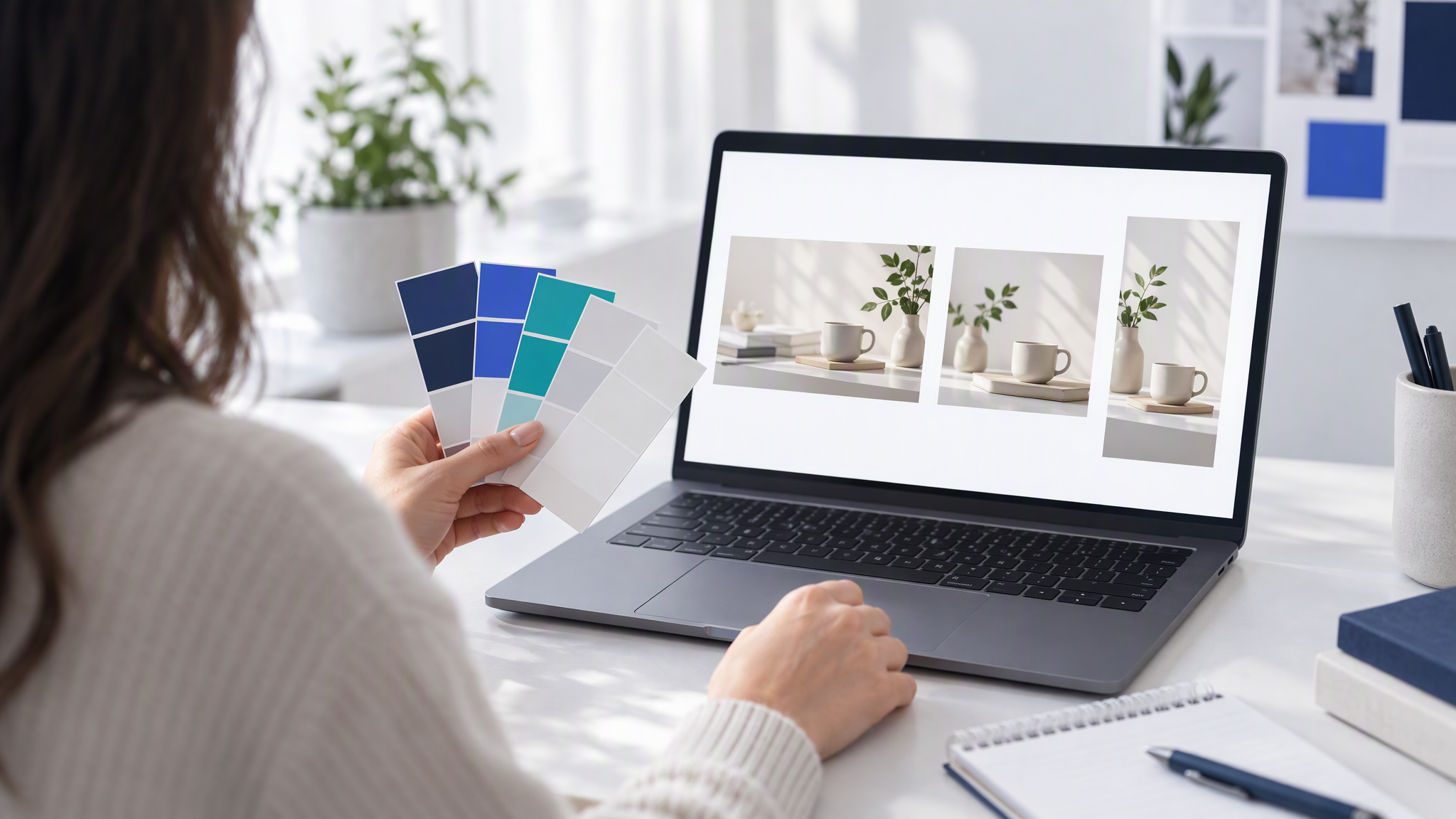
Check colours, light and subject. The warm brown, the direction of the light, and the product on the table should agree across the wide, the square and the tall file. If one file has drifted, drop that file and remake it from the same prompt and the same brand. Leave the good files as they are.
If a wider campaign has already drifted, the longer audit is in How to Spot and Fix Visual Brand Drift Across a Campaign. Sale-week creatives that still look like the everyday shop are in How to Keep Black Friday Creatives Looking Like Your Everyday Brand. Those guides assume a look you already have. This one is how the banner set gets that look before it goes live.
More on this cluster lives under Ads & campaigns.
If you want the three shapes to start from colours, a logo and reference photos you saved once, Brandiseer is where you upload your colours, logo, and references, then pick the brand before you generate. The size table, and the side-by-side check, are still the test.
One brand, three shapes, words kept separate
Save the brand once, make a clean image for each shape, and keep the logo and the headline as separate files. As of November 2026, Google's recommended sizes are 1200 x 628, 1200 x 1200 and 900 x 1600. Check the three files side by side, and check the specs in your account before you upload.