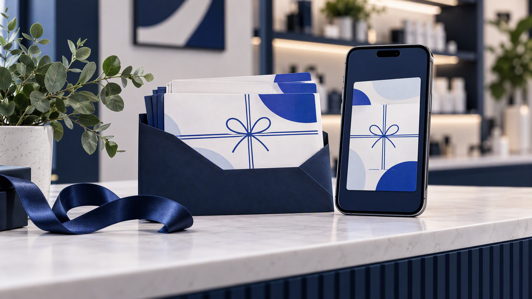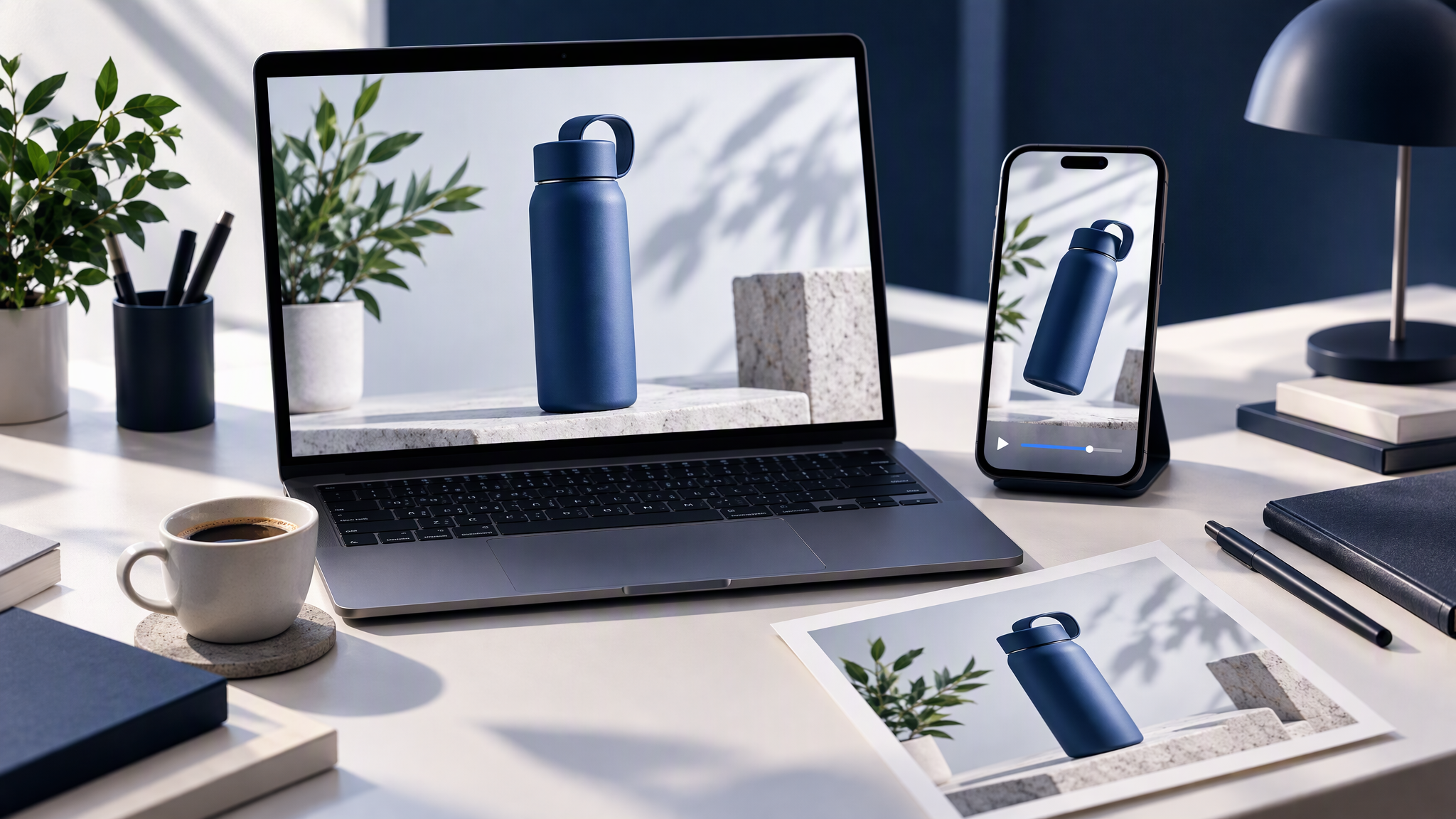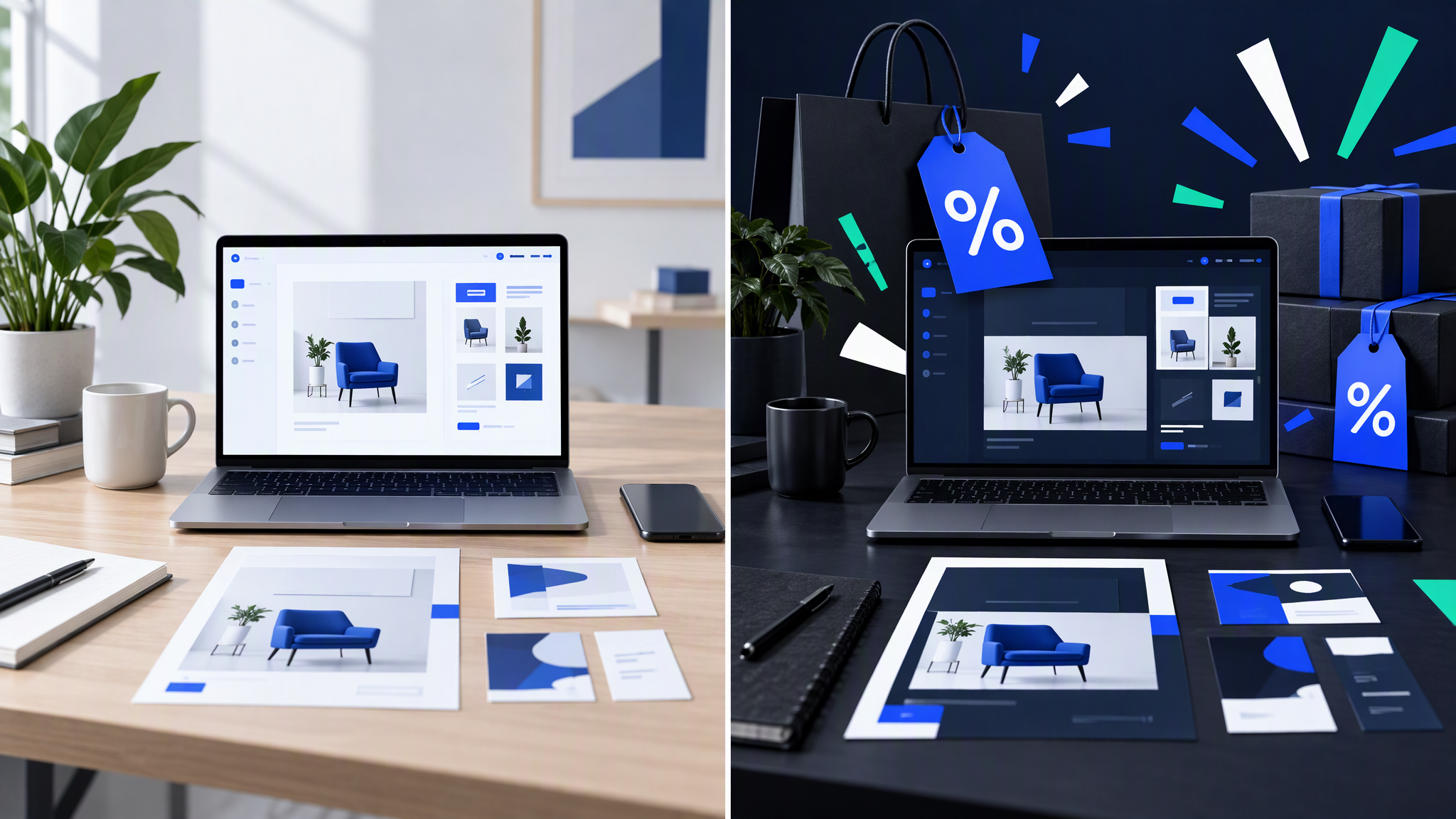
Late September is when small shops brief Black Friday and Cyber Week. The offer is real. The layouts often are not. A sale template arrives with a new palette, a new type mood, and product photos that no longer match the feed people saw in October.
Here is the answer-ready line: Black Friday creatives stay on brand when logo, colours, type, and photo style stay fixed, and urgency only changes layout intensity and offer messaging. If the sale ad needs a new colour system to feel loud, the brand will not survive November.
This is for an e-commerce or retail owner planning ads, email headers, social, and site banners now, especially if a past "festive" set looked like a different shop. You will lock the non-negotiables, decide where urgency is allowed to live, build one master for every crop, brief freelancers without a restyle, and run a two-week check against the everyday feed.
Why sale season breaks the look
Sale season rewards speed, and speed rewards defaults.
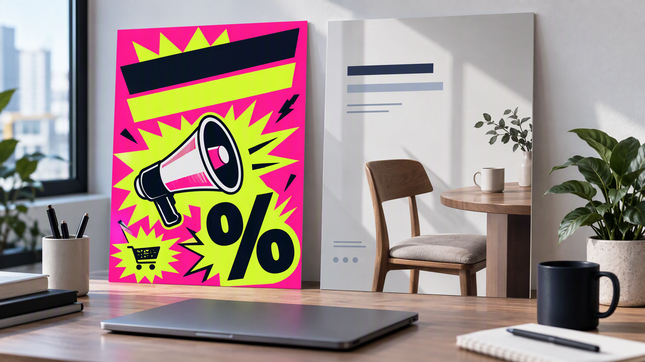
Marketplace and template galleries are loud on purpose. Neon badges, hazard stripes, condensed type that belongs to nobody. Drop your product into that frame and the frame wins. The product is yours. The shop is the template's.
"Make it festive" is an open brief. A freelancer hears permission to rebuild: new background, new illustration style, snow your October photography never used, a script font that lingers into December.
Every channel gets its own sale costume. Stories go neon. The email header goes red. The site banner goes black. The feed post stays everyday because nobody had time. One evening, four brands, one discount code.
Urgency gets confused with identity. A louder offer needs a clearer price, a clearer deadline, and a layout that can hold both. It does not need a new colour system.
After the weekend you have bought attention in a costume, then asked people to recognise you in normal clothes. The October feed and the November ad need to be obvious siblings.
Lock the non-negotiables first
Before anyone opens a sale template, write down what must not move.
Logo and clear space. Same mark as October. Same minimum size. No stretching, recolouring, or trapping the logo inside a new "SALE" badge. If the logo is a tiny corner under the badge, the sale owns the brand.
Core colours, plus one accent at most. Keep the colours that already run the site and the everyday ads. If you need urgency, add one accent you can name and retire, used only for the offer: a price chip, a deadline, a small block. A neon palette is not an accent. It is a replacement brand.
Type pair. Headline and body stay in the families you already use. Sale energy can be size and weight. It should not be a condensed display face that appears nowhere else.
Product photo style. If October is clean product on a light ground, November is that photography with a louder layout around it. Do not switch to a dark render, a cartoon, or a stock lifestyle set for the weekend. The product has to match the product page.
Write those four lines at the top of the brief. Everything else in this post is about staying inside them.
Where urgency can live
Loud is allowed. It has a short list of homes.
Headline size and weight. The offer can be the largest type on the layout. The font family still has to be yours.
Badge shape. One chip, circle, or corner tab for the discount or the end date, reused on every crop. Not a new icon family.
Contrast blocks. A solid block in a core colour, or in the single accent, behind the price. Contrast creates urgency. A new gradient system does not.
Countdown placement. Park the date in the same spot on every size: under the price, or in the badge. Do not let each channel invent a clock.
Offer words. "This weekend", "ends Sunday", "while sizes last". Copy can be urgent while the picture stays familiar.
Leave out a second palette, a festive illustration style, snow or confetti as a new photo language, and a logo redraw "just for the sale". If the ad only feels loud with a new colour system, fix the hierarchy. Do not replace the shop.
Everyday social already uses this discipline. How to Create On-Brand AI Social Content Across Every Channel is the non-sale version. Sale week is the same rule with a louder offer.
One master, every crop
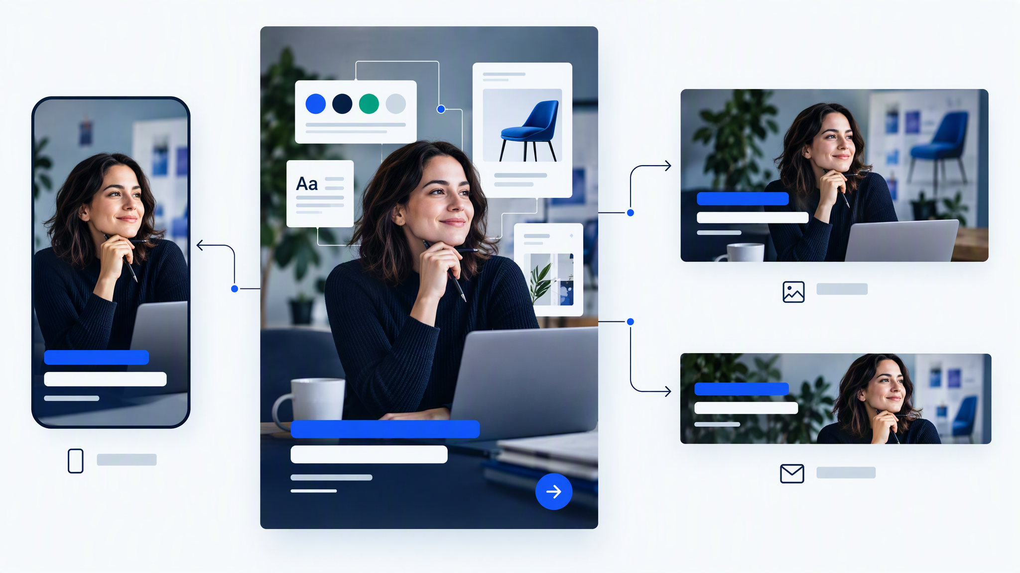
Build one on-brand sale master. Then resize it. Do not ask four people to "adapt the idea" in four tools.
The master holds the logo, the colour blocks, the type, the product photo, and the offer. From that file you crop or extend for Stories, the feed, the email header, and the site banner. Safe zones change. The shop does not.
The resize method, including why a fresh prompt per channel causes drift, is already written in How to Resize One Campaign Asset for Every Channel Without Drift. Use that guide. Do not invent a second one for November. If you are making the display banners from scratch, the sizes and the one-time brand setup are in banner ads with your brand kit.
Email is where sale templates most often win. A header that does not match the site is a different shop in the inbox. Pair the master with How to Keep Email Headers Matching Your Website and Social so the banner is a crop, not a redesign.
Practical order:
- Approve the master beside an October post and the homepage.
- Export the crops from that master.
- Check logo clear space and offer readability on the smallest size (usually Stories or a mobile banner).
- Only then write channel-specific captions. Copy can flex. The master should not.
If a crop truly cannot hold the offer, simplify the offer on that size. Do not restyle the brand to make the words fit.
The freelancer or agency brief for Q4
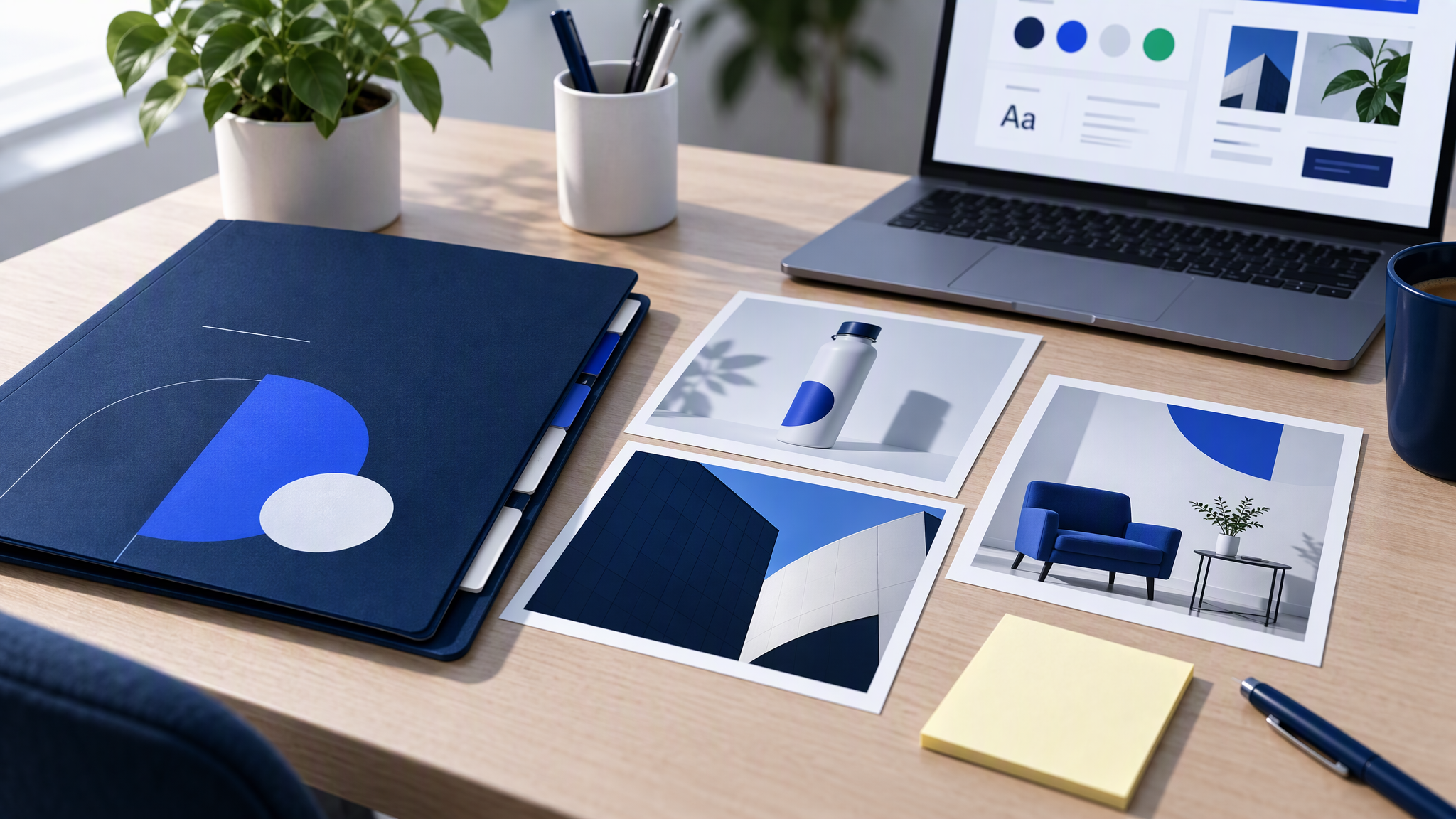
Outside help will "make it festive" unless the brief forbids the restyle. Send one page, not a mood board of other brands' sale ads.
Attach the brand kit, three approved October posts as the visual contract, and one line: sale energy, same brand. Urgency lives in the offer and the layout. It does not live in a new palette or a new photo style.
State the formats: one master, then crops for Stories, feed, email header, and site banner. Ask for that grid first, not fifty finals. Reject any file that fails a side-by-side with the October feed.
The handoff pattern is in How to Hand Off Your Brand Kit to Freelancers Without Visual Drift. For Q4, add the sale line and the October references. Do not send last year's neon files as inspiration. If someone needs a reference for "loud", point at headline size and the single accent, not at a competitor's Black Friday ad.
Two-week QA until launch
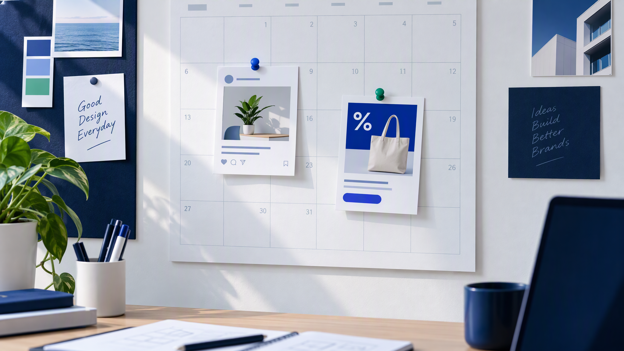
From the Friday you approve the master until launch, pin two images every Friday: one everyday post, and the Black Friday draft you are about to ship.
Pass only if logo, colours, type mood, and photo style still match, and the sale file is louder only in the offer and the layout. Fail a new palette, a new illustration habit, or a redrawn logo. Fix it before the next crop.
If the wider set is already messy, use How to Spot and Fix Visual Brand Drift Across a Campaign. These two weeks only need the pair of pins. Put that pair in the channel where you argue. Cyber Monday, if it sits in the same sale window, should come from the approved master. A second costume for Monday repeats the mistake.
Campaign posts in this cluster sit under Ads and campaigns.
FAQ
Can we use a marketplace sale template if we swap the colours?
Swapping colours helps and usually is not enough. Template type, badges, and photo treatment still read as the gallery. Start from your master, or strip the template until only your kit remains.
Is one accent colour enough to feel urgent?
Yes, if the offer is large and the contrast is clear. Urgency is hierarchy and words. A second full palette makes the ad louder and the brand weaker.
Should Cyber Monday look different from Black Friday?
Keep one master for the whole sale window. Change the end date and the offer line if you must. A new visual system for Monday is how the shop disappears mid-week.
What if last year's sale assets performed well but looked off-brand?
Keep the offer structure that worked: discount, deadline, product. Rebuild the visuals on this year's kit. Performance from a costume is a weak reason to wear the costume again.
Same shop, louder offer
Black Friday creatives fail when the sale template replaces the brand people already know. Lock logo, colours, type, and photo style. Let urgency live in size, a single accent, a badge, and the words. Build one master and crop it. Check it against the October feed every Friday until launch.
You can do that with the kit you already have. Generate the sale master from the same kit as October so November does not inherit a template. Brandiseer can hold that kit if you want the file to start from the saved look. A shared folder and the Friday pins are enough if you keep them.
The brand does not get a holiday from being recognisable. The offer does the shouting.