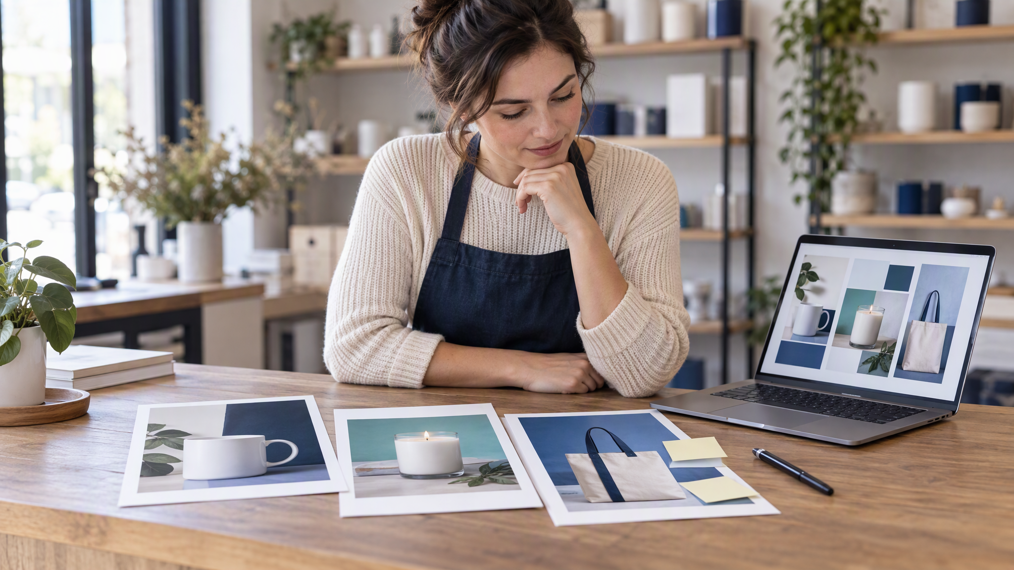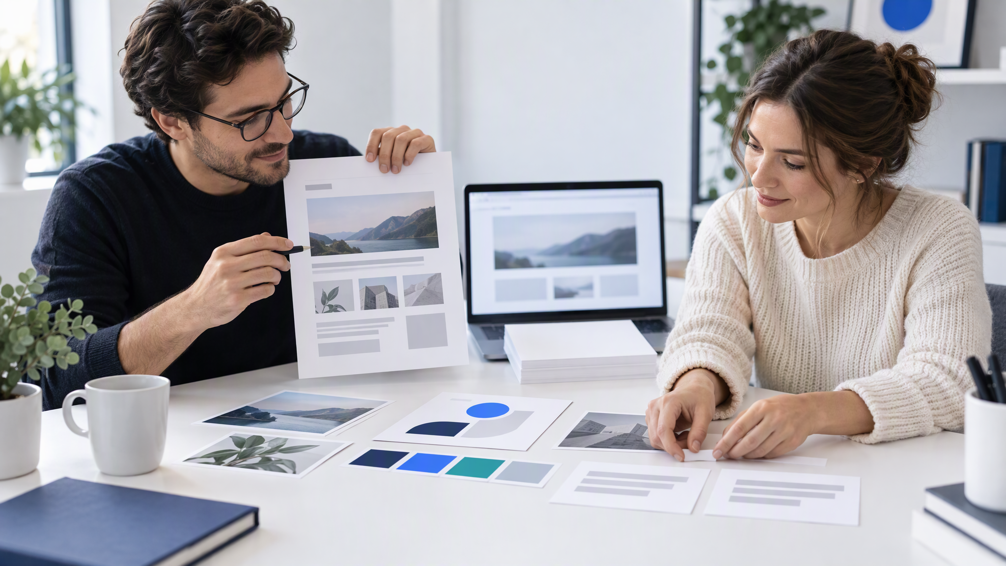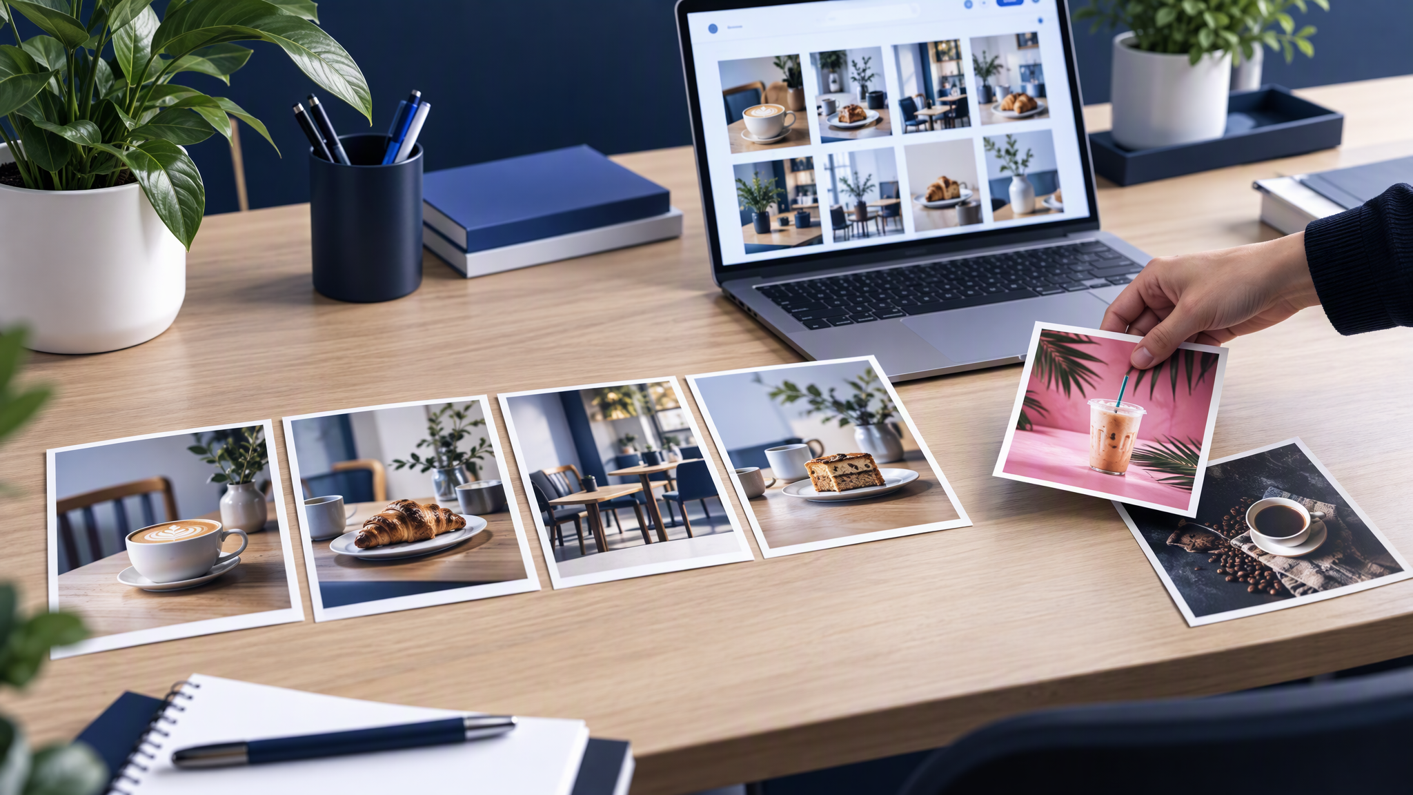
AI images look almost on brand when the tool only knows what each prompt restates, so colours survive but photo style and setting drift. Fix the inputs, then let the tool learn the brand: Brandiseer's Deep Brand Understanding (21 Aug 2026) is a per-brand switch for that.
This is for an owner, or the one person who does the marketing, who already generates pictures for posts and ads. The results are close. You still redo or hand-fix image after image, and November is when the next campaign needs to go out. The colours look like yours. The photograph does not.
Why AI images look almost on brand
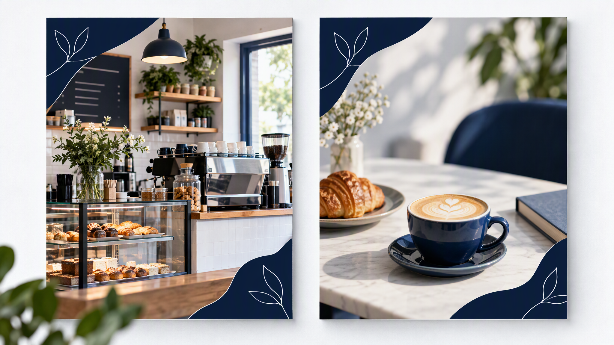
AI images look almost on brand because the tool rebuilds the brand from whatever that prompt restates. Colours are easy to name, so they survive. Photo style, composition and the things you never do are harder to restate, so they drop out.
A general image tool does not open your website between requests. Each generation starts from a blank canvas plus a few words. Name a colour and a product, and you get that colour and a product. You do not get the framing of your last six posts, the light you actually use, or the props that would never sit on your counter.
That is why a batch can look fine and still look like someone else's shop. The next prompt is another guess. A longer sentence gives the tool more words to improvise from, not a record of the shop.
Keeping the words in the box to subject and scene, and leaving colour and type to the brand, is a different job, covered in How to Write Image Prompts That Don't Break Brand Guidelines. This post is the step before the wording: why the result is nearly yours, and how to close that gap at the source.
What does "almost on brand" usually mean?
It usually means the colours and the logo are right, and the photo style, the layout habits or the setting are not.
Four misses show up on the same wall, once you pin the new image next to the homepage.
Photo style. The site uses real daylight in the shop. The new image is a smooth stock scene, a different grain, or a light you have never had. The colour values match. The photograph does not.
Composition. Your posts leave quiet space and keep the product in a familiar place. The new image fills the frame, crops the product, or centres everything like a template. The layout feels borrowed.
Setting and props. The product sits on a marble table, in a studio, or in a room you do not have. A café post shows a generic counter. The colours are yours. The place is not.
People and poses. A model, a hand or a smile that has never been in your shop. Or no people, when your best posts are the team at work. The pose is a stock pose.
Check only the colour, and all four can pass a glance. Put the image next to the homepage and they fail. "Almost" is not a small colour error. It is the right palette in the wrong kind of picture.
Fix the inputs before the prompt
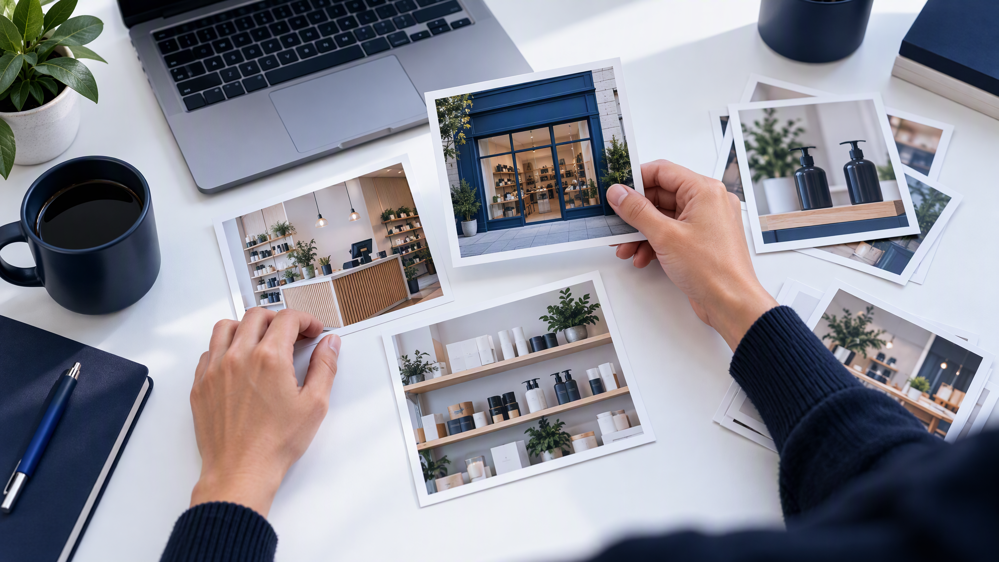
Fix the inputs before you write another prompt. Use real reference photos from the website and from the posts you would still publish. Pick 3 to 5 colours, and give each one a job. Pick two fonts. Write three rules for what the brand never does.
Reference photos. Take them from the live site and the best recent posts, not from a search for a mood. Four to six is enough. If a photo is from a campaign you would not run again, leave it out. The next batch will repeat what you show it, including the frame you have retired.
Three to five colours, each with a job. Background, text, the product colour, and one small highlight. Take them from the site. A palette you liked this morning is a new brand.
Two fonts. The headline and the body you already use. A third display face for "a bit of energy" is how the next image stops looking like the site.
Three "never" rules. For many small shops that is no neon, no cartoon people, and no busy backgrounds. "Keep it premium" gives a tool nothing to refuse. A rule you can point at is a rule you can fail a picture with.
The longer packing list is in What to Put in Your Brand Kit Before You Use AI. Do that before you ask for a new picture. A prompt cannot repair a kit made of the wrong photos.
Let the tool learn the brand, then switch on deeper understanding
In Brandiseer, wait until Brand Intelligence is ready for that brand. Then turn on Deep Brand Understanding for that brand. Generate as usual in Visual Generator or Creative Mode.
The note Deep Brand Understanding that actually drives generation, shipped on 21 August 2026, is the limit of what this post will claim. It is a per-brand switch. When it is on, new work in Visual Generator and Creative Mode stays closer to how that brand looks and feels, without you restating the whole brand in every prompt. It works best after Brand Intelligence has finished learning that brand. The note's own order is the one to follow: enable it after Brand Intelligence is ready, generate as usual, and judge the next batch.
This post adds no accuracy figure, no percentage, no price and no plan name. The note does not publish any of those.
Judge a batch, not one image
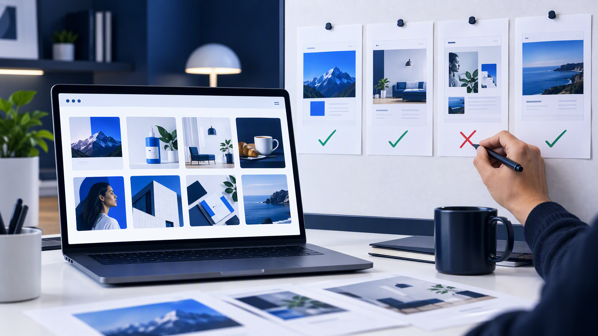
One image can look lucky. A batch shows whether the look holds.
Generate 6 to 10 pieces for a real job you are about to publish. Pin them next to the homepage and the last six posts. Mark each pass or fail on the four misses above: photo style, composition, setting and props, people and poses.
A pass is a picture a stranger would place with the homepage. A fail is the right colour in the wrong photograph, the wrong room, or a person who does not belong. If most of the batch fails the same way, the inputs are still thin. If one image fails, drop it. Do not restyle the set to match the odd one.
If you are making a month of posts in one sitting, the plan is in How to Batch a Month of On-Brand Social Posts in One Afternoon. Run this batch test before you fill the calendar.
When it is still "almost"
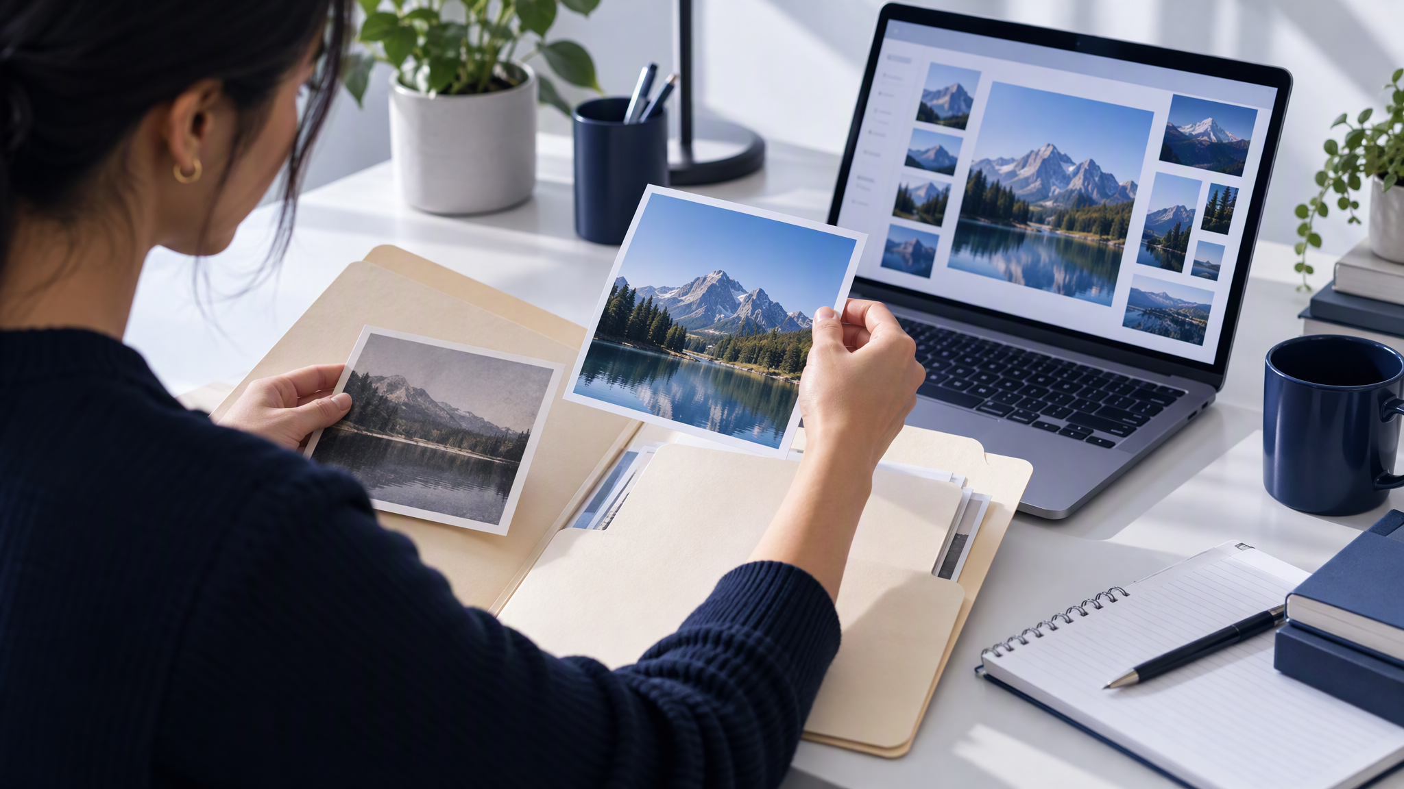
Go back to the inputs. The usual culprit is the reference photos. Do not answer a near miss with a longer prompt.
Swap the photo that does not belong. Add one from the site that shows the light and the setting you actually use. Remove a reference from a campaign you have retired. Then generate the batch again and pin it next to the homepage. You are correcting what the tool can see, not bargaining with a sentence.
Spotting drift in work you have already published is a different job, in How to Spot and Fix Visual Brand Drift Across a Campaign. That guide is the audit of a set that is already live. This post is how the next batch starts closer, before you schedule it.
If the idea in the box is only half a sentence, Brandiseer has a separate step for the wording. Brand-aware Prompt Enhancement, shipped on 22 August 2026, turns a rough idea into a sharper image prompt that already respects your brand. It is one calm button in the composer. The note says it works best when the brand profile is already in good shape. Use it after the photos, colours, fonts and "never" rules are right. It does not replace them.
More on this cluster lives under AI tools.
Close the gap at the inputs
Almost is the colours without the photograph. Put real reference photos, 3 to 5 colours with a job each, two fonts and three "never" rules in place before the next prompt. In Brandiseer, wait until Brand Intelligence is ready for that brand, turn on Deep Brand Understanding, and generate in Visual Generator or Creative Mode as usual. Then judge 6 to 10 pieces beside the homepage and the last six posts, not one lucky frame.
If you want that per-brand switch on a brand the tool has already learned, Brandiseer is where Deep Brand Understanding lives. The comparison with the homepage is still the test.