To build a social media kit from your logo, pick 3 to 5 colours from it, choose two fonts and a photo style, and write three "never" rules. Save all of it in the tool you post with, so every image starts from the same kit.
This is for a solo founder or small business owner with a logo, often a new wordmark (a logo made from the business name) or a simple picture mark, who needs to post on Instagram, LinkedIn or Facebook this month without a designer. The logo file is the only finished piece until the colours, type and photos are chosen and saved.
What tool helps me build a full social media kit around my logo?
Any tool can hold the kit; the work is deciding what goes in it. If you only have a logo, spend an hour picking colours, two fonts and a photo style first, then save them in the tool you will generate posts with. Owners posting several times a week should use an AI image tool that saves the brand and lets you pick it before every image, such as Brandiseer. If you post once a month, a shared folder with a one-page kit is enough.
What a social media kit needs beyond the logo
A social media kit from your logo is the short list beside the file: logo versions, colours, two fonts, a photo style and three "never" rules. Without the list, every new post invents a fresh shop.
Logo versions. Keep the full logo, a simple icon if you already have one, and a note of which backgrounds it can sit on, light and dark. Use that same file on every post this month.
3 to 5 colours, each with a job. One lead colour taken from the logo, one dark colour for text, one light colour for backgrounds, and one accent for small details. A fifth colour is optional.
Two fonts. One for headings and one for shorter lines, chosen to sit calmly next to the logo.
A photo style. Four to six pictures with the same light, the same distance from the subject, and the same mood.
Three "never" rules. Name three refusals: a stock room that is not your shop, a colour off the page, and a font you have never used. "Keep it premium" gives a tool nothing to refuse.
Write the list before you open an image tool. You decide the page. The tool stores it.
Pick your colours and fonts from the logo
Start with the colour that dominates the logo. If the mark is mostly one blue, that blue is the lead. Then choose one dark for text, one light for backgrounds (usually the off-white already behind the mark), and one accent for a small dot or a thin rule. Stop at five.
Check the pairs on a phone at arm's length. Dark text on the light background, light text on the lead colour. If you have to squint, change the pair. This is practical advice for a small screen.
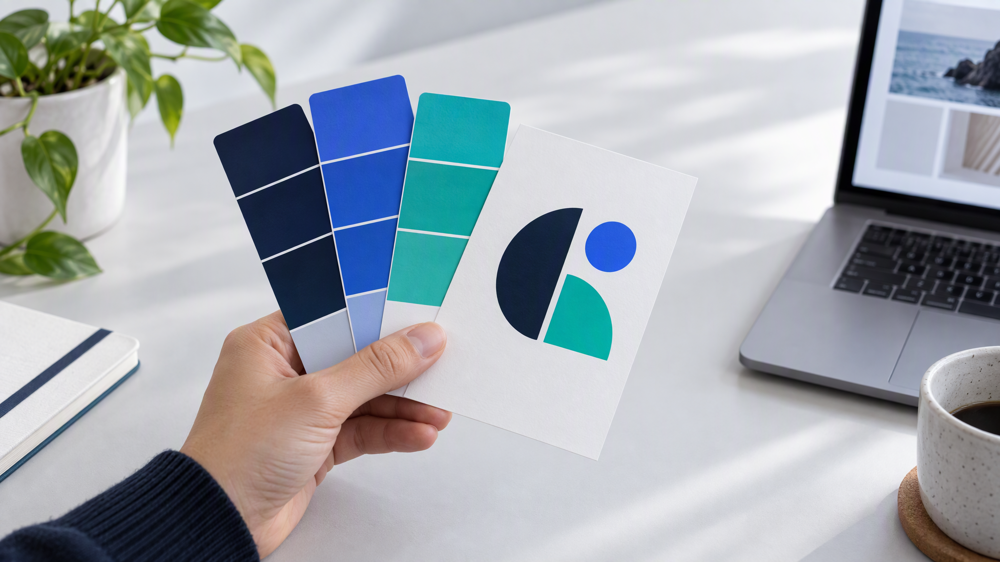
Choose one heading font and one body font that sit beside the wordmark. Pair a heavy geometric logo with a plain body font, and a script logo with a simple heading font. Use fonts you can select in the tool you post with, and write the names next to each colour's job: lead, text, background, accent.
Set a photo style with 4 to 6 reference images
A photo style is a short stack of pictures. "Warm, clean, friendly" means something different in every tool. Four to six photos of your own product, counter or workshop, shot in the same light and from a similar distance, mean "match these".
Use your own photos where you can: the same window, the same table, the same mood. Leave out stock rooms, filtered shots and old campaigns you would not run again. Phone pictures are fine when they match that light.
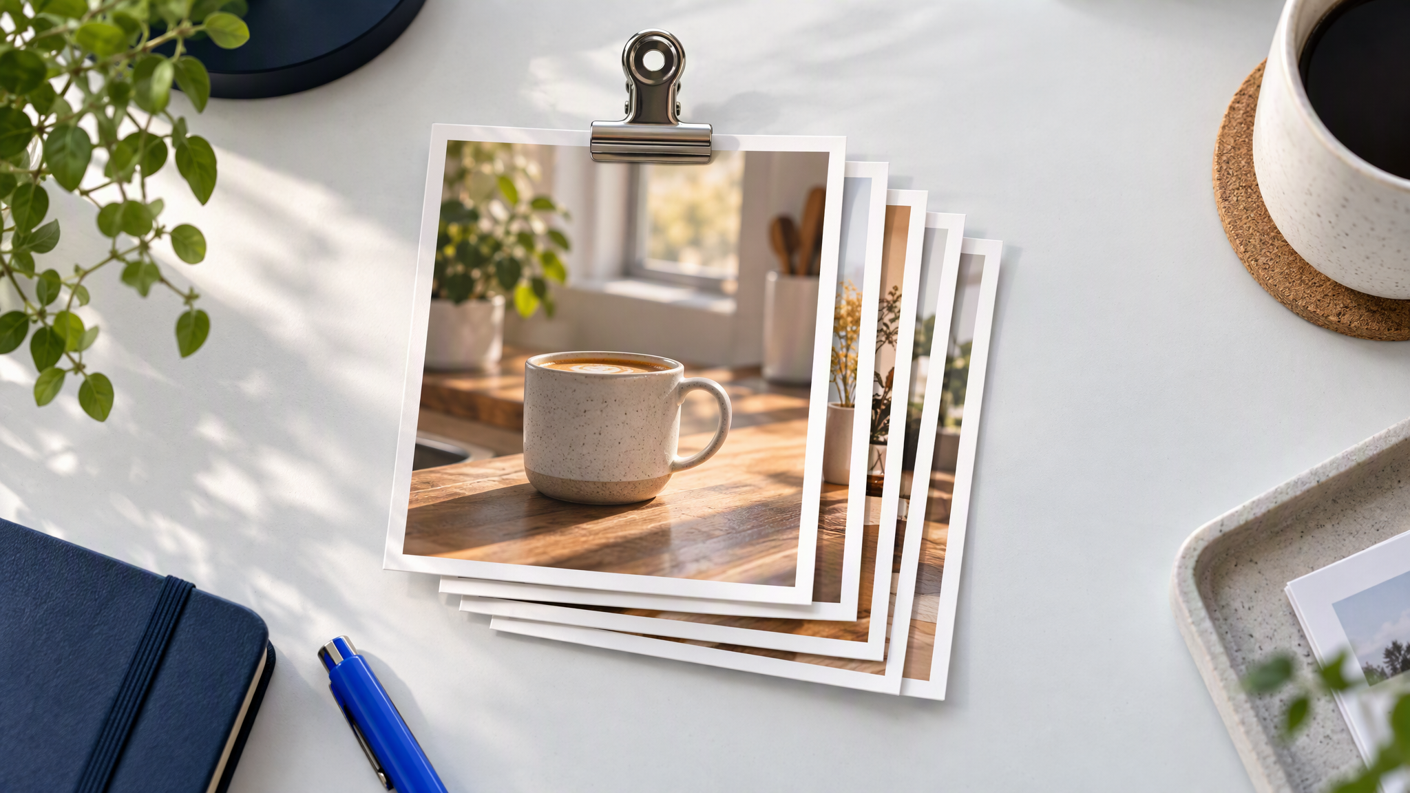
Keep the files in one folder named with the year. When a picture stops looking like the shop, replace it. The next batch repeats whatever is in the stack.
People who already have brand files to sort can use What to Put in Your Brand Kit Before You Use AI. That guide starts from assets you hold. This one starts from the logo and builds the missing pieces, including these references.
Six post types to set up once and reuse
Set up six post types once. Give each type one layout, in a square and in 4:5, the taller portrait crop. After that you change the subject, and the layout stays.
Offer. The thing on sale, lead colour as a block, product in the photo style. Keep a changing price in the caption.
Product. One product, the reference light, plenty of the background colour, the same crop each time.
Behind the scenes. The real bench, counter or packing table, in the same light as the reference stack.
Tip. One short point a customer can use, in the heading font on the background colour.
Review quote. The customer's words in the text colour. A face only when the person is real and you have permission to show them.
Announcement. A new product, a closed day or a date, with the same margins as the offer card.
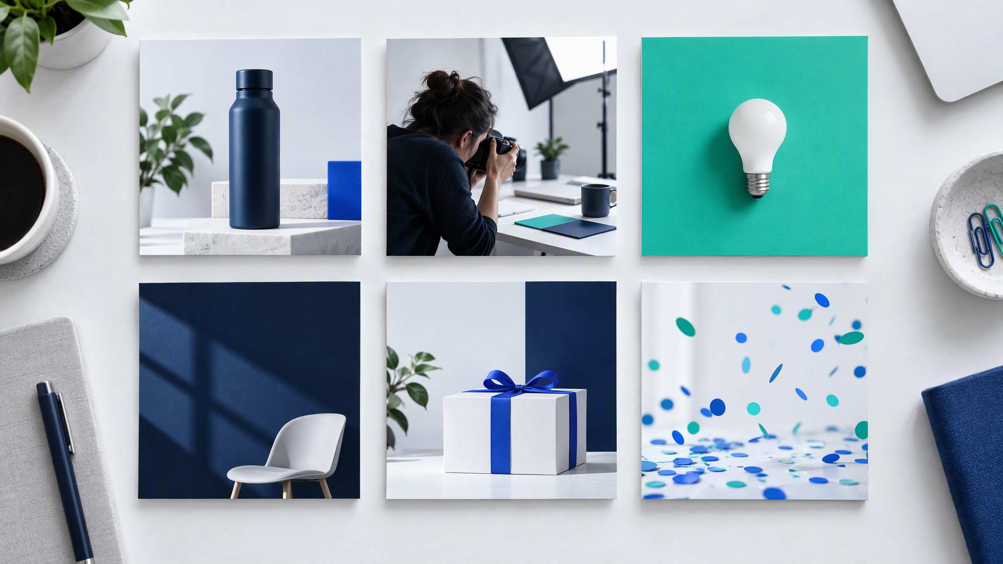
Make the square and the 4:5 from the same layout. A square also works on LinkedIn. Keeping those channels as one business is in How to Keep LinkedIn and Instagram Looking Like the Same Brand. Posting with no designer at all is in How Founders Without a Designer Keep Every Post Looking the Same. Stay with these six for a few weeks before you add another layout.
How to save your kit in Brandiseer and generate the first posts
Upload your colours, logo and references, then pick that brand before you make a picture. You choose the colours and the fonts. The tool stores what you upload.
As of October 2026, the note Brand-aware Prompt Enhancement, shipped on 22 August 2026, says Enhance turns a rough idea into a sharper image prompt that respects the brand, and that it works best when the brand profile is in good shape. Type the offer or the product and press Enhance.
As of October 2026, the note Prompt-first Dashboard to Chat creation workspace, shipped on 24 August 2026, says you choose the brand and the aspect ratio on the Dashboard, and Generate opens Chat with that setup. The last brand you used is remembered, so read the name at the start of a session.
Switch on Deep Brand Understanding once the brand has been learned. As of October 2026, Deep Brand Understanding that actually drives generation, shipped on 21 August 2026, is a per-brand switch that works best after Brand Intelligence has learned the brand. With it on, new work in Visual Generator and Creative Mode stays closer to how that brand looks and feels.
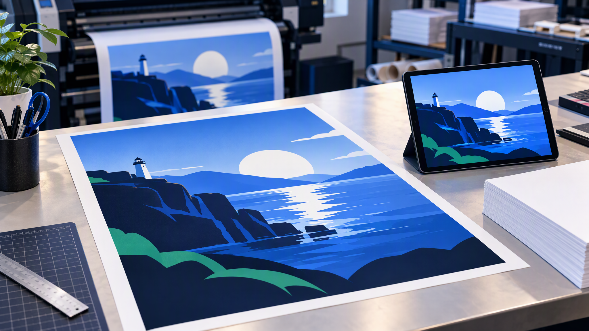
If a post also needs printing, use Ready Format on a result you already like. As of October 2026, the note Ready Format for printable, full-bleed output, shipped on 20 August 2026, aims at printable full-bleed output instead of a framed mockup. Judge the bleed on the file you would send. These notes list no price, as of October 2026, and this post adds none.
Check the first ten posts before you keep going
Make ten posts from the six types, mixing squares and 4:5 crops. Pin them in a grid next to the logo and the one-page kit.
Keep a post a stranger would place with the logo. Send back a colour off the page, an unnamed font, a different light, or a layout outside the six. Three repeats of the same miss means correct the kit. One stray post means remake that post.
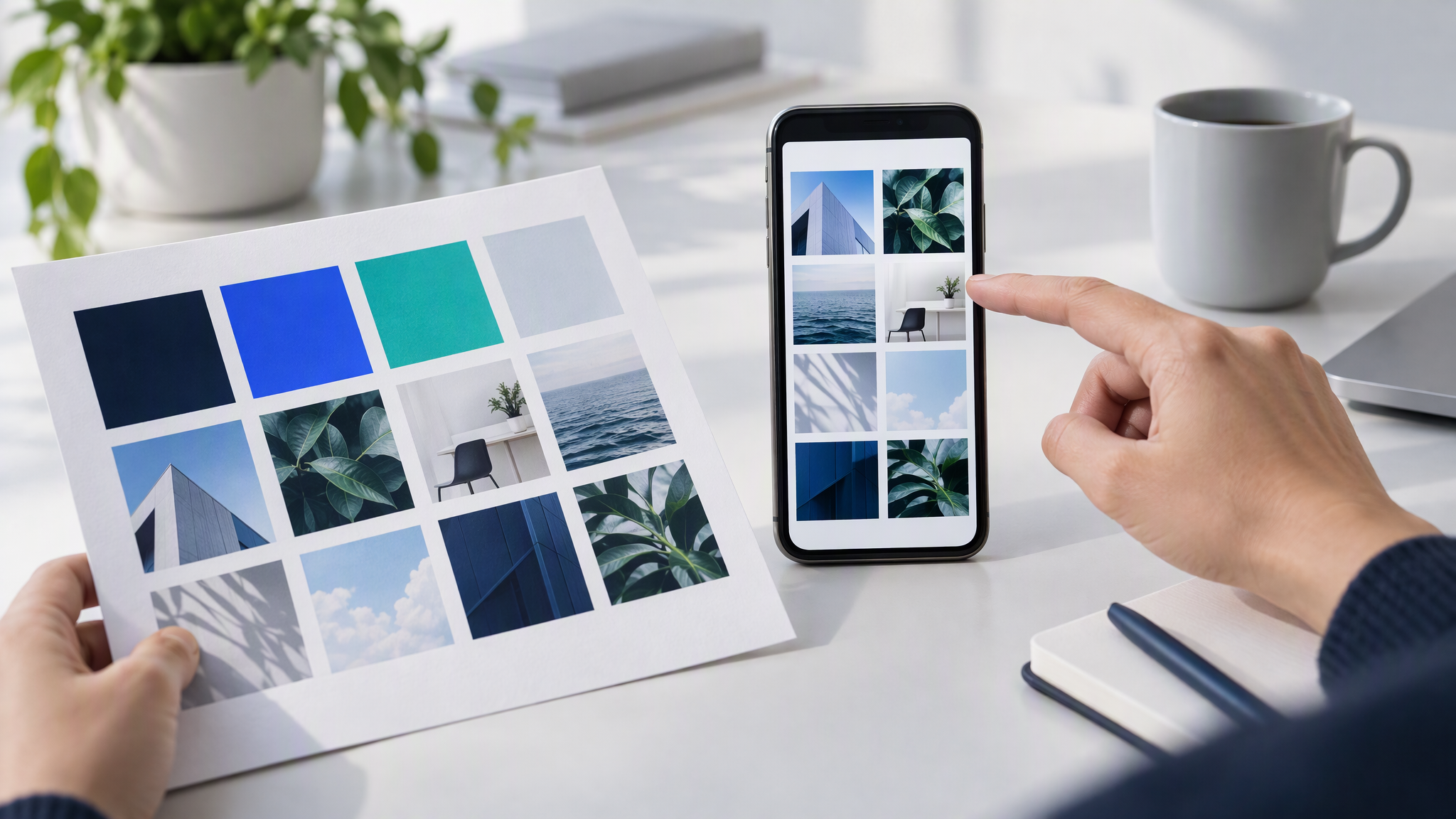
When the ten hold together, batch the rest of the month from the same kit. That afternoon is in How to Batch a Month of On-Brand Social Posts in One Afternoon.
More on this cluster lives under Social posts. To keep the colours, logo and references saved for the next image, upload them on Brandiseer and pick the brand on the Dashboard before Generate.
One logo, then a kit you can repeat
Pick 3 to 5 colours, two fonts, a stack of reference photos and three "never" rules. Save them, make ten posts, and keep going only when those ten look like the same business.