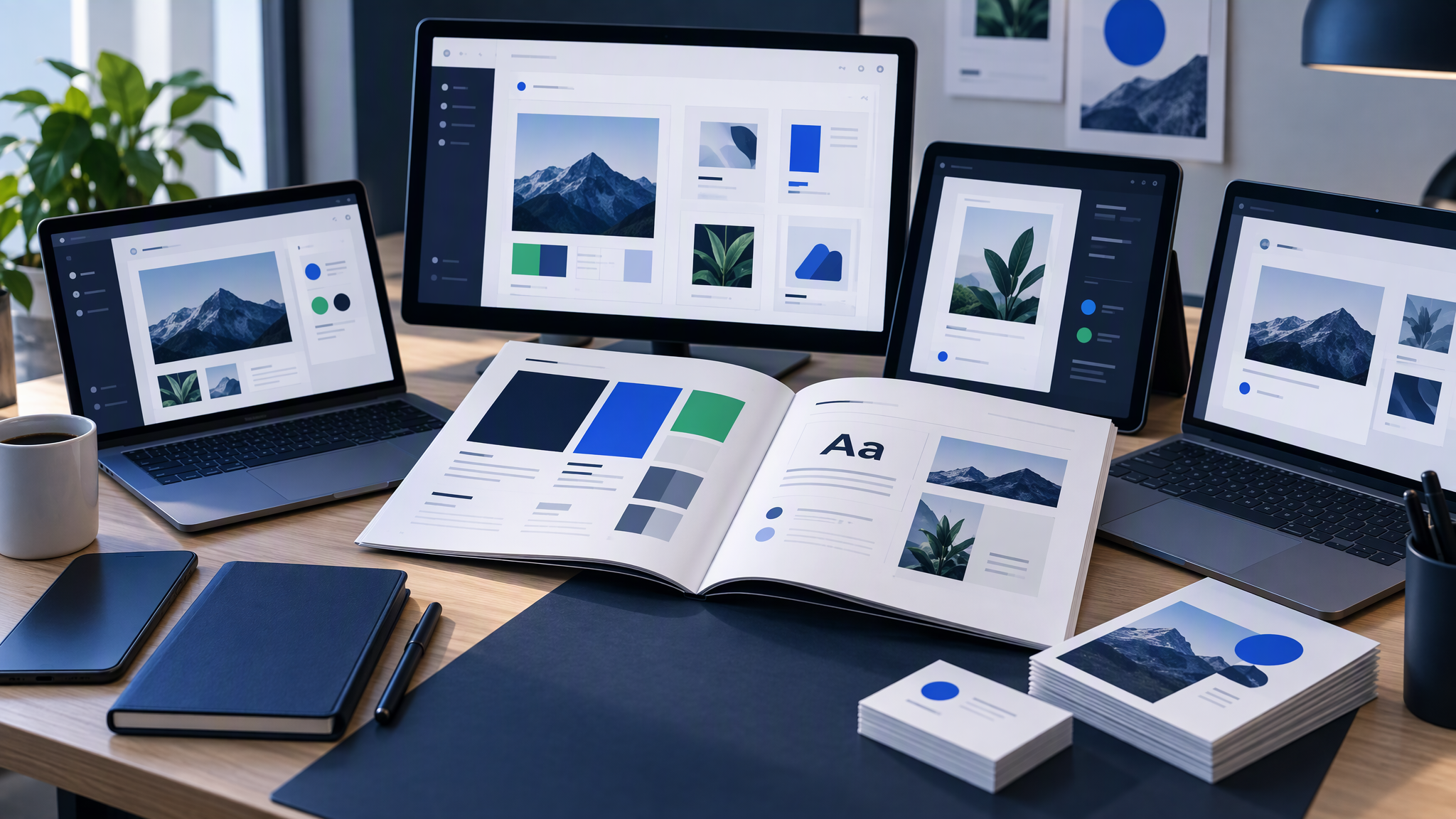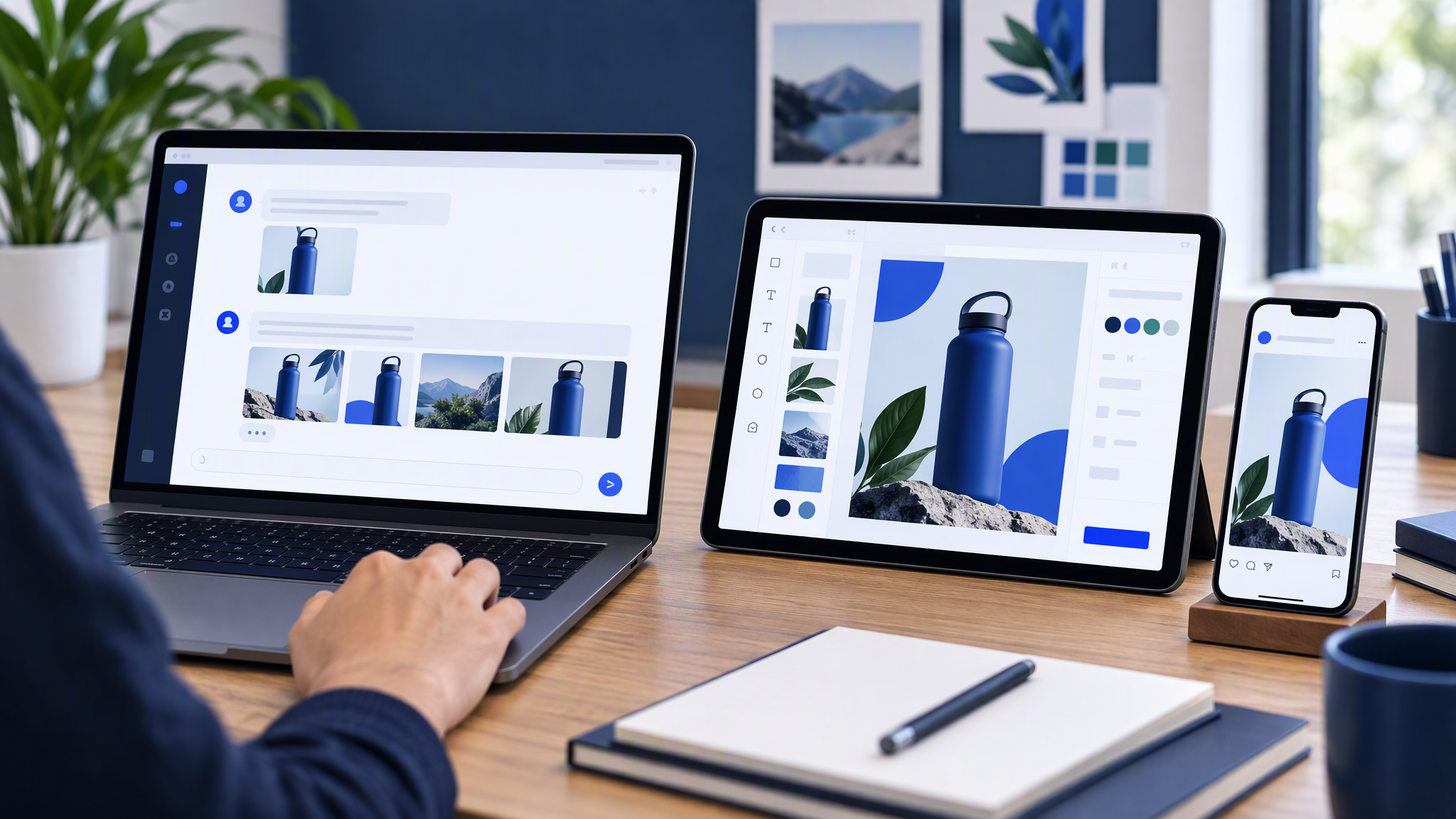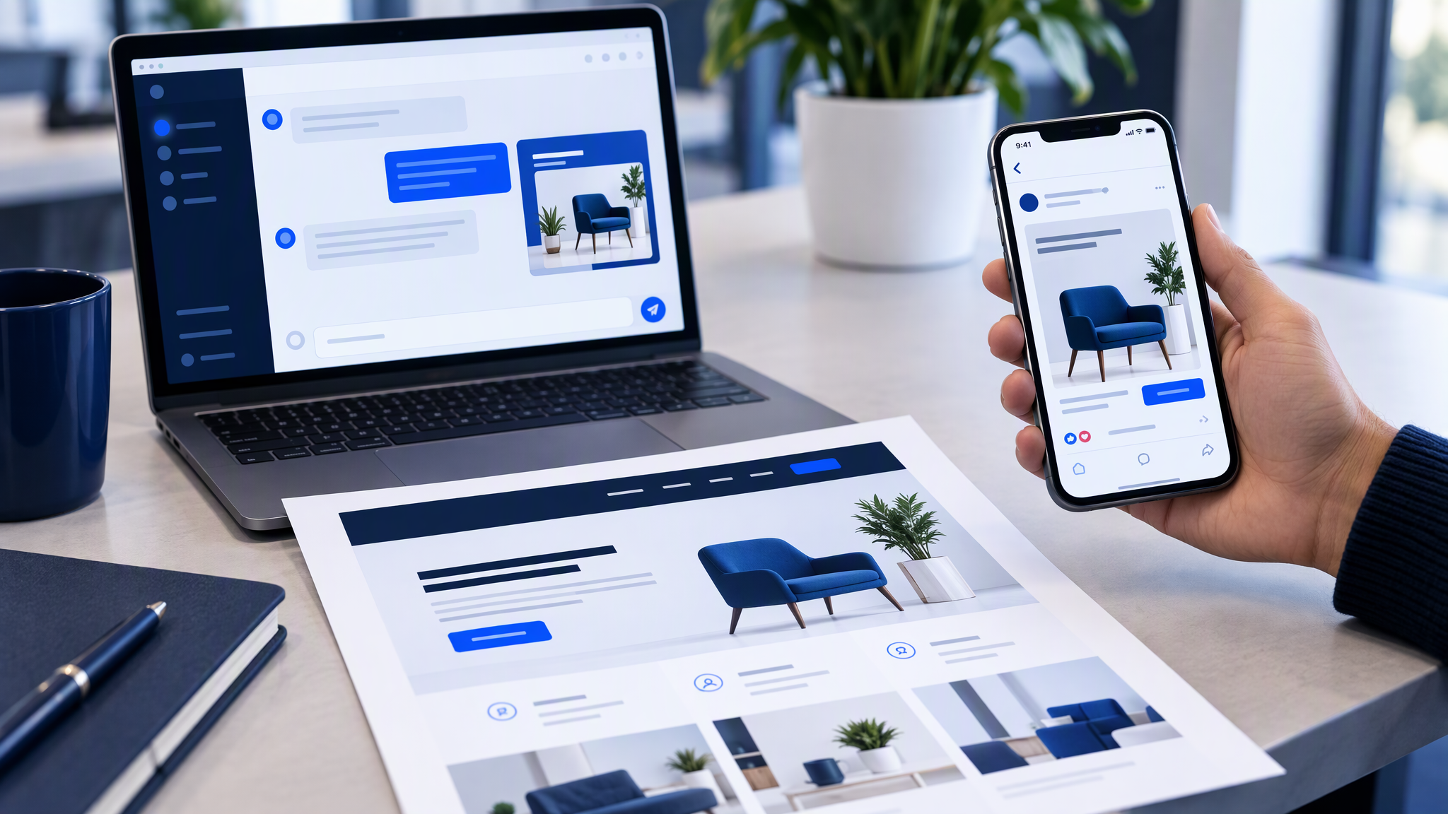
You generate an image in ChatGPT or Claude, drop it into the feed, and then scroll past your own homepage. The product is the same. The company is not. The chat image has a new lighting mood, a logo treatment you never approved, and colours that do not appear on the site or in last week's ad.
Here is the answer-ready line: AI chat images stay matching when the brand kit owns colour, logo, and photo style, and the chat only specifies the subject and scene. Re-typing "make it on brand" in ChatGPT or Claude each time is why the feed and the website look like different companies.
This guide is for an owner or marketing lead who already drafts in chat, ships Canva or social from another tool, and notices the mismatch. You will see why chat images drift, what matching looks like in practice, the tiny kit to save before the next session, how to brief the scene without restyling the brand, and a five-minute weekly check.
Why chat images drift
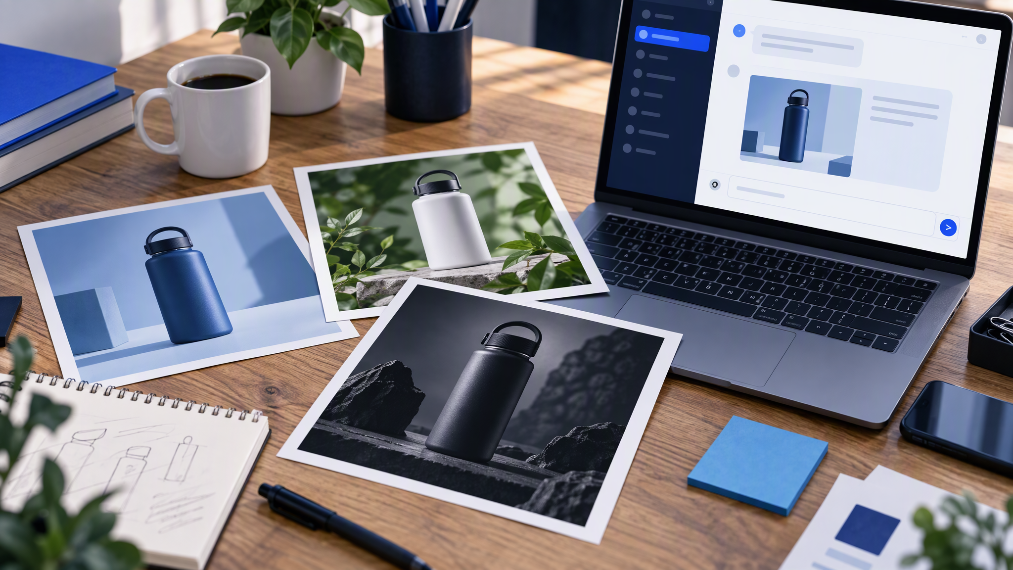
Each session starts cold. The assistant does not remember last Tuesday's approved crop unless you bring something durable into the thread. A paragraph of style words is not durable. It fights last week's look.
The prompt becomes a second brand. "Warm, premium, airy, soft daylight, our blue" means something different every time, and something different from the homepage. The site already decided the blue. The chat invents a cousin.
Tools split the work. The website lives in one builder. The Meta ad lives in Ads Manager or Canva. The new image is born inside ChatGPT or Claude. Nothing in that chain forces the three files to share a logo or a photo style unless a kit does.
Volume hides the mismatch. One lucky image looks fine in the chat window. Next to the homepage and the live ad, the drift is obvious. Most teams judge the file where it was made, which is the one place the comparison is missing.
"Make it on brand" is not an instruction. The model cannot see your kit from that sentence. It improvises. The next thread improvises differently.
Customers feel separate shops before they can name the cause. Recognition is how a small brand gets value from spend it already makes. Chat images that restart the look spend that recognition down.
What matching means in practice
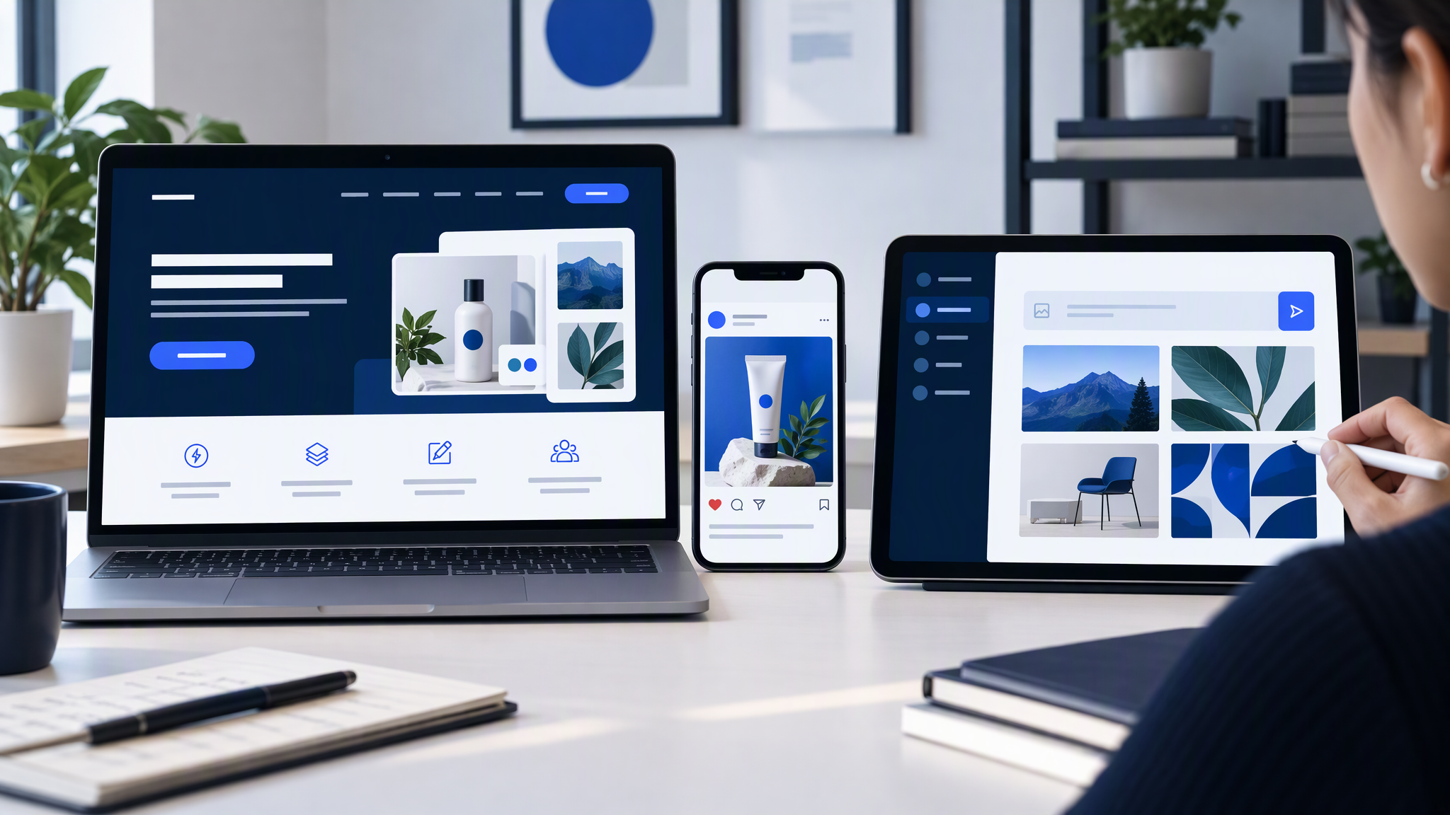
Matching is a side-by-side test, not a vibe. Open three surfaces at once: the homepage, a current Meta ad, and the new chat image.
Ask three questions only.
Colours. Do the same colours dominate, in the same roles? A white site and a charcoal chat image are different brands, even if both files are tidy.
Logo treatment. Same mark, same clear space, same habit of where it sits. A chat image that redraws the logo, recolours it, or locks it in a new badge has left the kit.
Photo style. Clean product versus lifestyle clutter. Hard flash versus soft daylight. If the site is calm product photography, a new set dressing is not a variation. It is a second shop.
Subject, offer, and crop can change. Identity should not. If a stranger can tell the three files belong together in three seconds, you are matching.
The same test shows up when LinkedIn and Instagram drift apart. The fix is one look, then crops, in How to Keep LinkedIn and Instagram Looking Like the Same Brand. Chat images are another surface in that set.
Build a tiny kit before the next chat
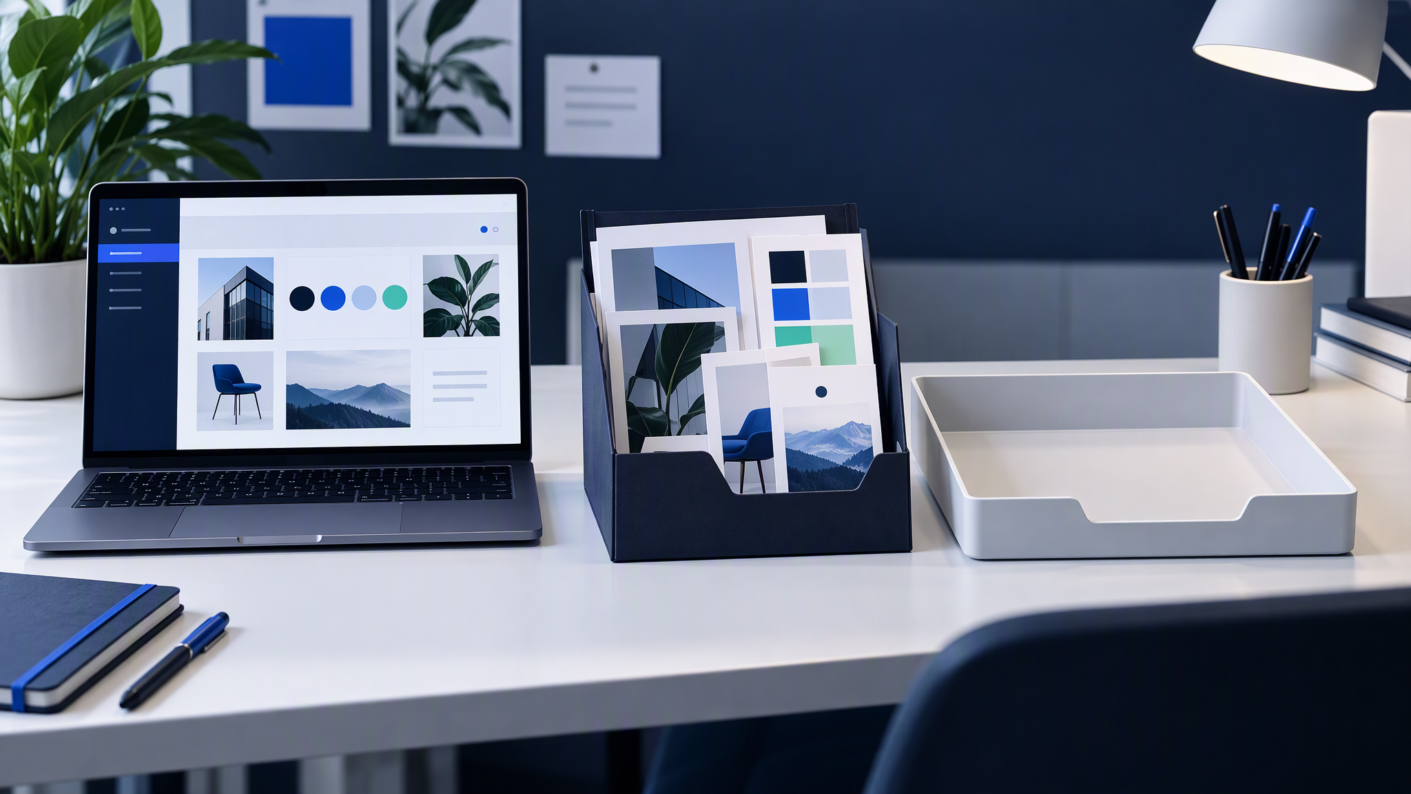
Save this once. Do not rebuild it inside the prompt.
1. Logo file. The real mark, in a format someone can place without redrawing it. Light and dark versions if you ship both. One rule: do not stretch it, recolour it, or invent a monogram.
2. Three to five brand colours. The colours already on the homepage and in ads, with a role for each: background, product, text, or small highlight. Name the combinations you refuse.
3. Fonts, or a type rule. If type is set in Canva or on the site, name the families. If the chat would invent decorative lettering, say so: generate the picture, set type in the layout tool.
4. Four to six approved reference images. Mix product and lifestyle, and only include frames you would still ship. New chat images should sit beside these without looking like another company. Optional: one "never this" example with a reason.
Put the kit where the next person can find it: a named folder, a Brand Kit in the layout tool, or a Brandiseer profile. A personal Downloads folder is not a kit. The longer packing list is What to Put in Your Brand Kit Before You Use AI.
The kit is the identity. The chat is not.
Chat for scene, kit for identity
Once the kit exists, change how you talk to the assistant.
Ask for subject and composition only. "Bottle on a pale table, three-quarter view, space on the left for a headline." "Shop counter, product in front, square crop." That is a scene brief.
Do not restate the brand in the same prompt. Navy, the font name, "premium but friendly", and "make it on brand" overwrite last week's look. If the kit holds colour, logo, and photo style, the prompt should not argue with it.
Attach references from the approved set only. A random frame from the web teaches a new dialect. An approved product shot teaches the one you already ship.
Generate a small batch, then stop. Three options beside the homepage beat thirty inside the chat. Publish the one that survives the side-by-side.
Set type outside the image when you can. Chat models still invent messy lettering. A clean picture plus real type in your layout tool matches the site more often than a poster baked into the file.
The longer version of this split is How to Write Image Prompts That Don't Break Brand Guidelines. Short version: the assistant casts the scene. The kit plays the brand. If a draft feels off, regenerate from the kit, or update the kit because the site moved. Do not negotiate a private style inside one thread. If the colours match the site and the photo still looks borrowed, read why those AI images look almost on brand.
A weekly five-minute check
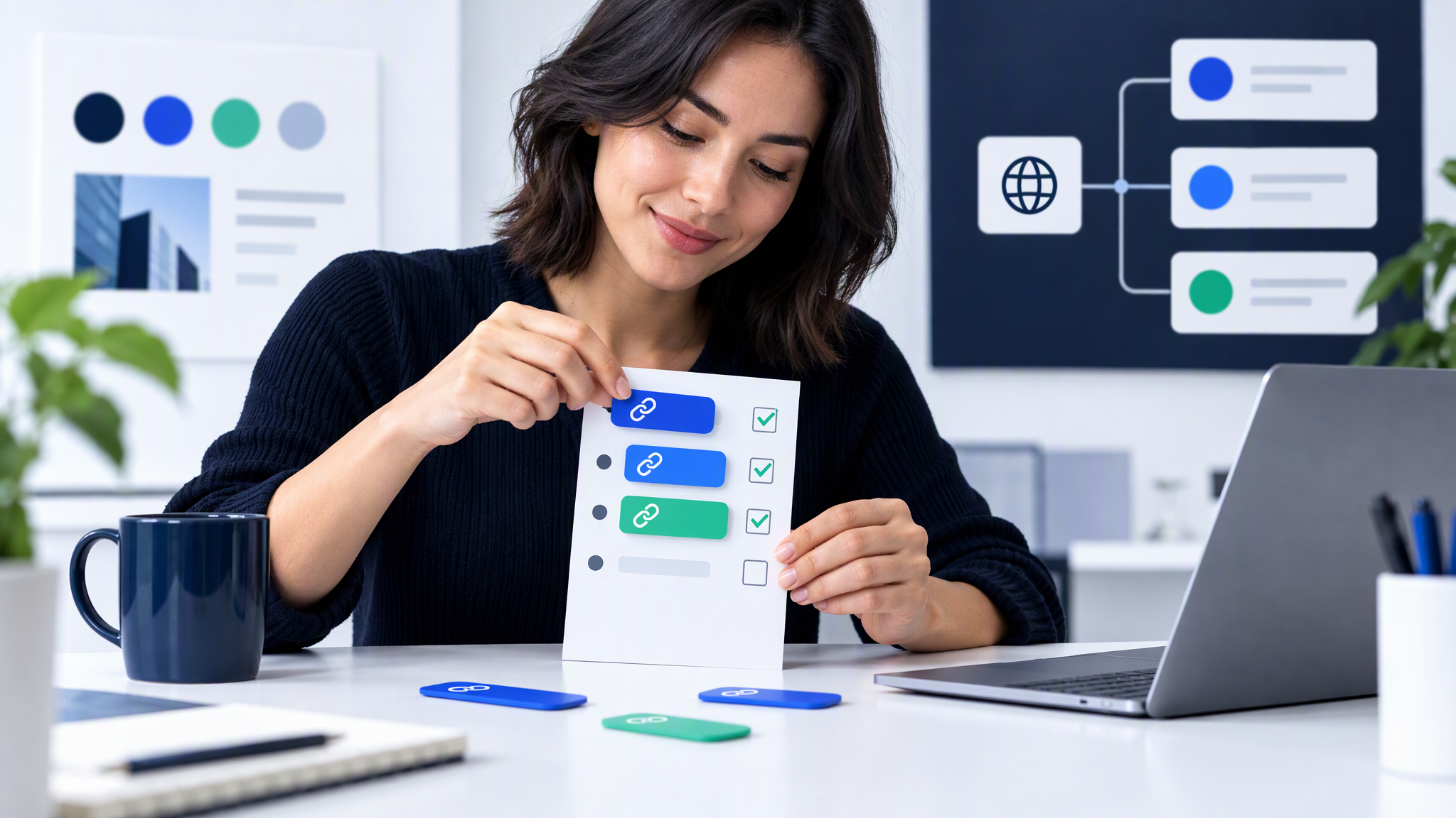
Pin three URLs every week: the homepage, the latest live ad, and the latest chat image you are about to publish. Open them together. Reject anything that fails the side-by-side.
Use the same three questions: colours, logo treatment, photo style. Then ask whether this file invented an accent the other two do not have. Accents need an owner and an end date. A chat-only accent becomes the accidental brand by Friday.
Keep a one-line log. "Rejected: new warm background." "Shipped: same desk crop as the ad." Paste the log into next week's brief as a scene constraint, not as a restyle.
If a whole campaign is drifting, use How to Spot and Fix Visual Brand Drift Across a Campaign. The weekly check is the small version you can keep. Five minutes is enough because you are refusing files, not redesigning the brand.
When the kit should live in the generator
A disciplined folder can do this job: kit in a shared drive, scene-only prompts, Friday side-by-side.
Brandiseer fits when chat images, ads, and site visuals should start from the same saved look instead of a fresh description in every thread. You upload logo, colours, fonts, and reference shots once. The next generation inherits them. You still choose the subject, the crop, and what ships.
Use it when several people generate and each holds a slightly different prompt, when the site and the paid ad already match and chat is what breaks the set, or when ad crops and social crops need one kit rather than a chat dialect plus a Canva dialect. Stay manual when one person makes occasional images and applies the kit by hand.
More posts on this cluster live under AI tools.
FAQ
Can I fix drift by writing a longer ChatGPT prompt?
A longer prompt usually adds more style words, which is how the look drifts. Shorten the prompt to subject and scene, and let a saved kit own colour, logo, and photo style.
Do Claude and ChatGPT need different kits?
No. One kit, both chats. If each assistant gets its own colour list, you have two brands. The tool can change. The references should not.
What if we do not have a designer?
Use what the website already shows. Logo, the colours on the page, the type you actually set, and four images you are proud of. A thin kit from the live site beats a perfect PDF nobody opens.
How many reference images are enough?
Four to six. Include product and lifestyle if you ship both. More than that becomes a mood board the next person will cherry-pick.
One kit for the chat, the ad, and the site
Chat images drift because every session starts without the look you already decided. Save the kit once. Ask the assistant for the subject and the scene. Check three URLs before you publish.
AI chat images stay matching when the brand kit owns colour, logo, and photo style, and the chat only specifies the subject and scene. When Brandiseer holds that kit, the next chat image can start from the same place as the website and the ad, instead of from a fresh "make it on brand".