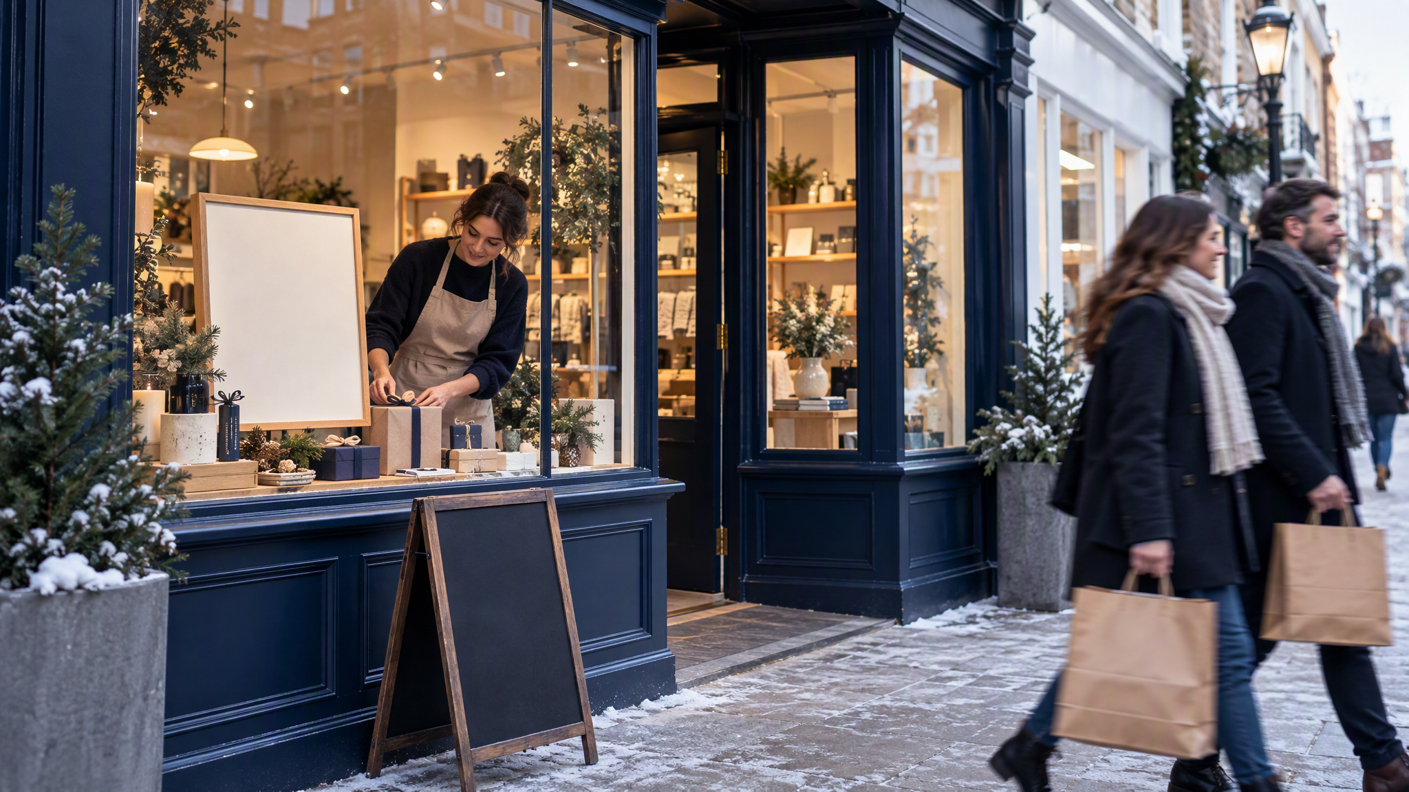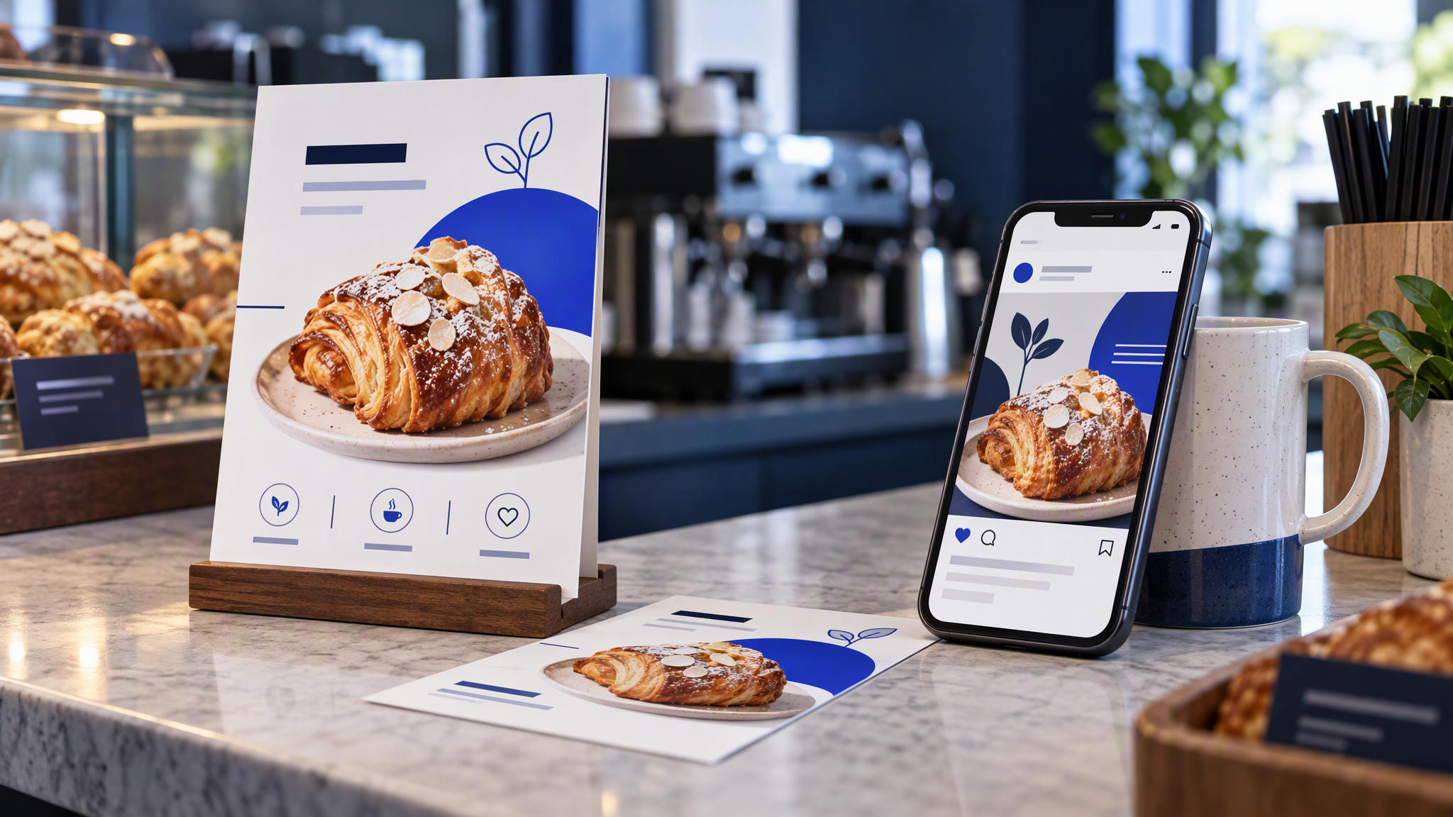
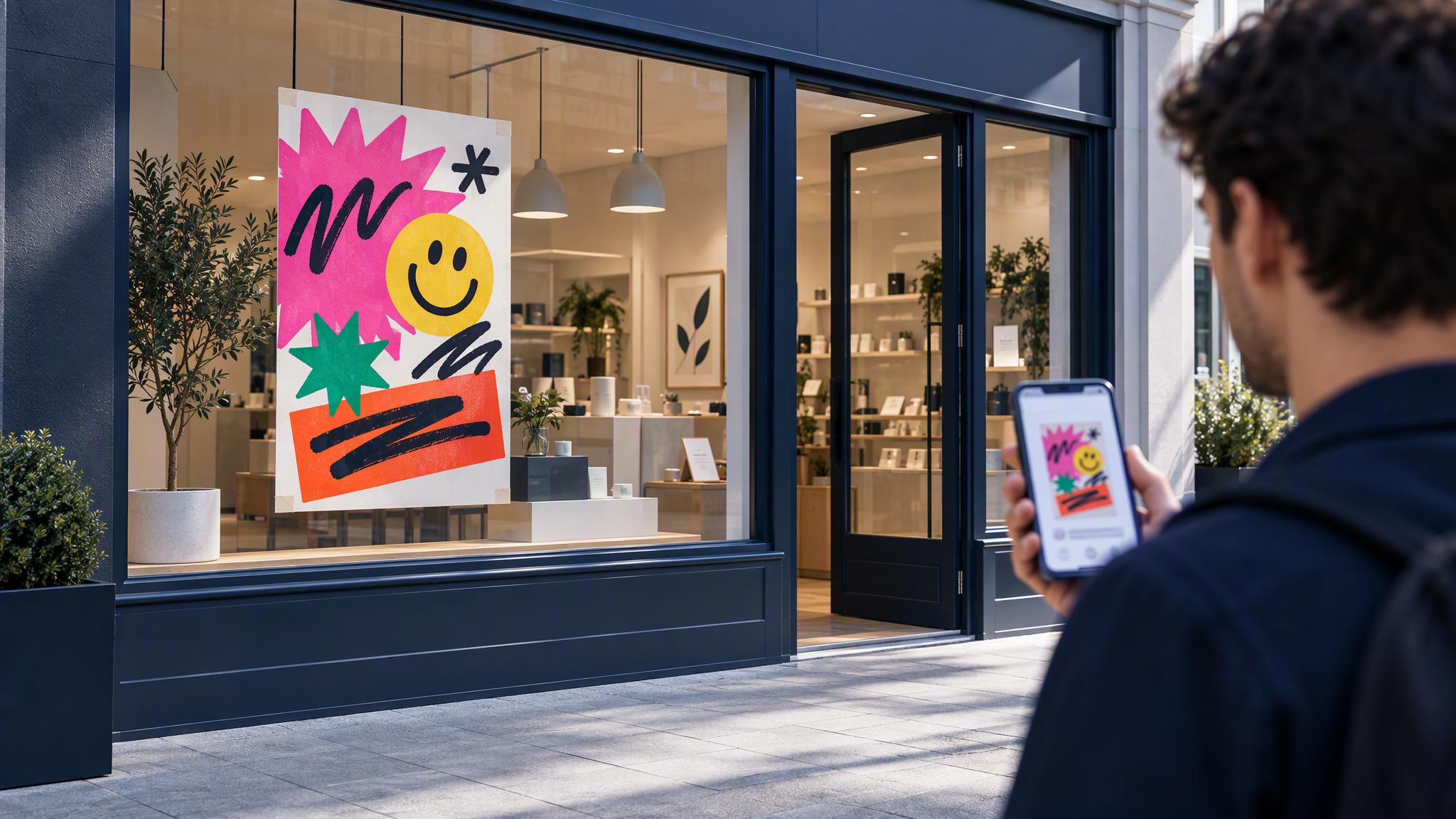
Autumn and winter menus are going up now. The Instagram grid already shows the shop: the pastry, the cup, the colours, the way you photograph the counter. The flyer, the window poster, and the printed menu are often made in a rush, from a template or by the local printer, and they look like a different business. Someone walking past does not connect that poster with the account they follow.
Here is the answer-ready line: Printed menus and flyers stay on brand when they come from the same logo, colours, fonts and photo style as your Instagram, and the seasonal special is designed once then resized for print and social. If your window poster needs its own look to feel seasonal, customers walking past will not recognise the shop they follow online.
This is for the owner or manager of a café, bakery, salon, or other local shop swapping the menu and the seasonal flyers this month, who posts on Instagram and usually gets print done in a hurry.
Other guides here stay on digital surfaces: social, email, ads, decks. This one is print next to Instagram. If LinkedIn and the grid have already split, start with How to Keep LinkedIn and Instagram Looking Like the Same Brand. The window is another surface. It should still be the same shop.
Why print drifts
Print rewards speed, and the people who make it often start from a blank file.
Printer templates bring their own shop. A menu template arrives with a script face, a border, and a palette from the gallery. Drop your pastry into that frame and the frame wins. The Instagram photo of the same pastry cannot compete with a border the grid has never used.
A late word-processor file is a second brand. Default type and clip art can be accurate on prices and still unrecognisable as your shop.
A friend who is good at design rebuilds the look. Without your logo placement, your two fonts, and your photo style on the page, they will make a handsome flyer for a shop you do not run.
Season is treated as permission. Autumn leaves, a winter script, a new background: each feels timely and replaces the colours people already know. A special can be louder. It should not be a different business.
The grid took months to become recognisable. One print run can undo that on the street.
What has to match
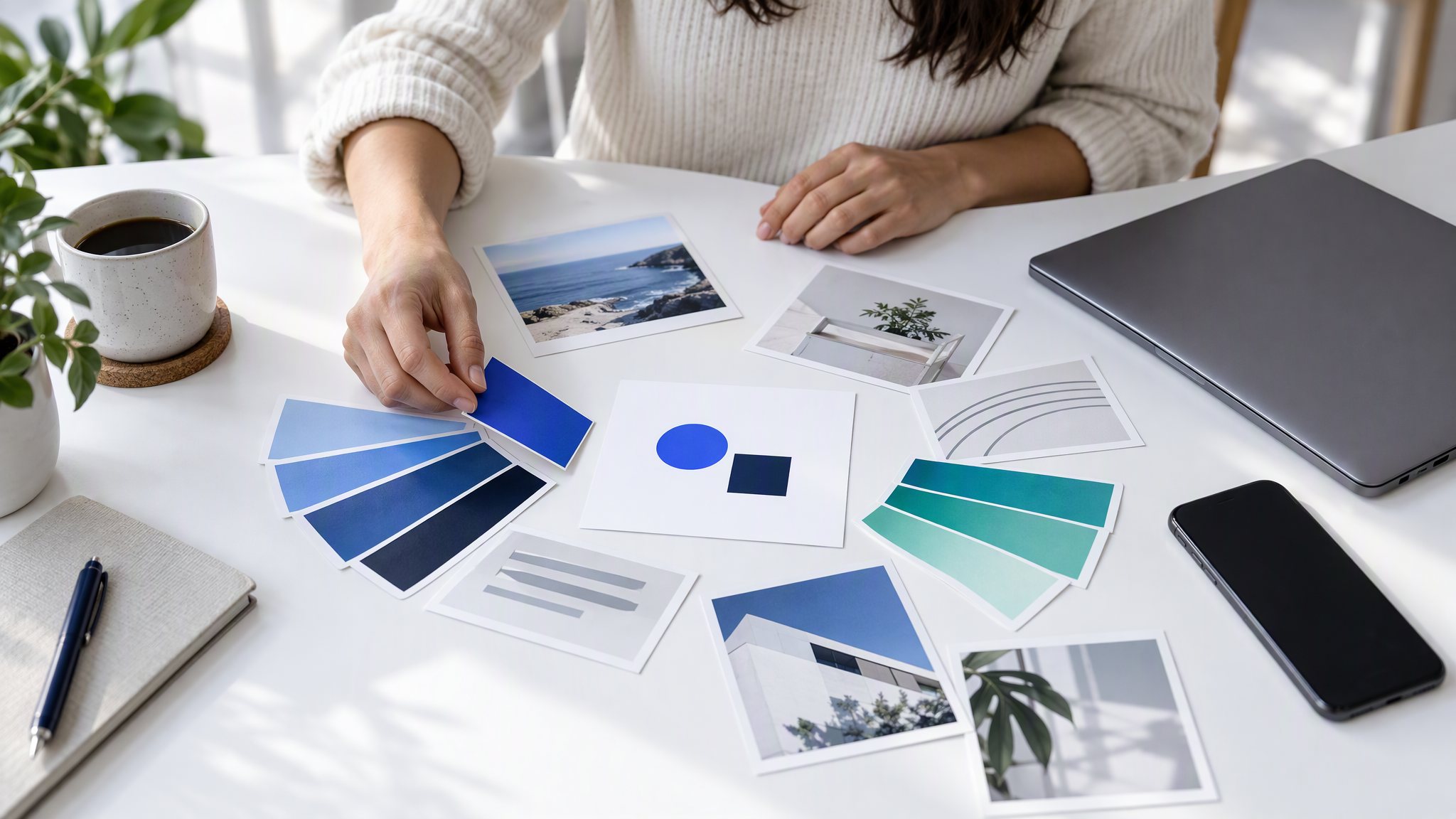
Put the grid next to the menu, the flyer, and the poster before anyone opens a template. Four things have to agree.
Logo and where it sits. Same mark as the profile, with the same habit of placement. No stretching, no recolour, no seasonal badge around it. If the logo is a speck under the decoration, the template owns the shop.
Core colours. The colours already in the grid and on the cups, the bags, or the chairs. Seasonal energy can be a louder block in those colours. A new autumn palette is a replacement brand.
The two fonts. Headline and body, the ones you already use when type appears on posts. Print can be larger. It should not introduce a face the phone has never shown.
Photo style. If the grid is daylight on the real pastry, the flyer uses that photography, or a new photo made the same way. A cartoon, a stock flat-lay, or a heavy filter is another shop.
The special, the price, and the dates can change. If a regular can tell the poster and the grid belong together in three seconds, you are matching.
A café does not need a long brand book. It needs the logo, the colours, the two fonts, and a few photos you would still post. The packing list is What to Put in Your Brand Kit Before You Use AI.
One kit, two outputs
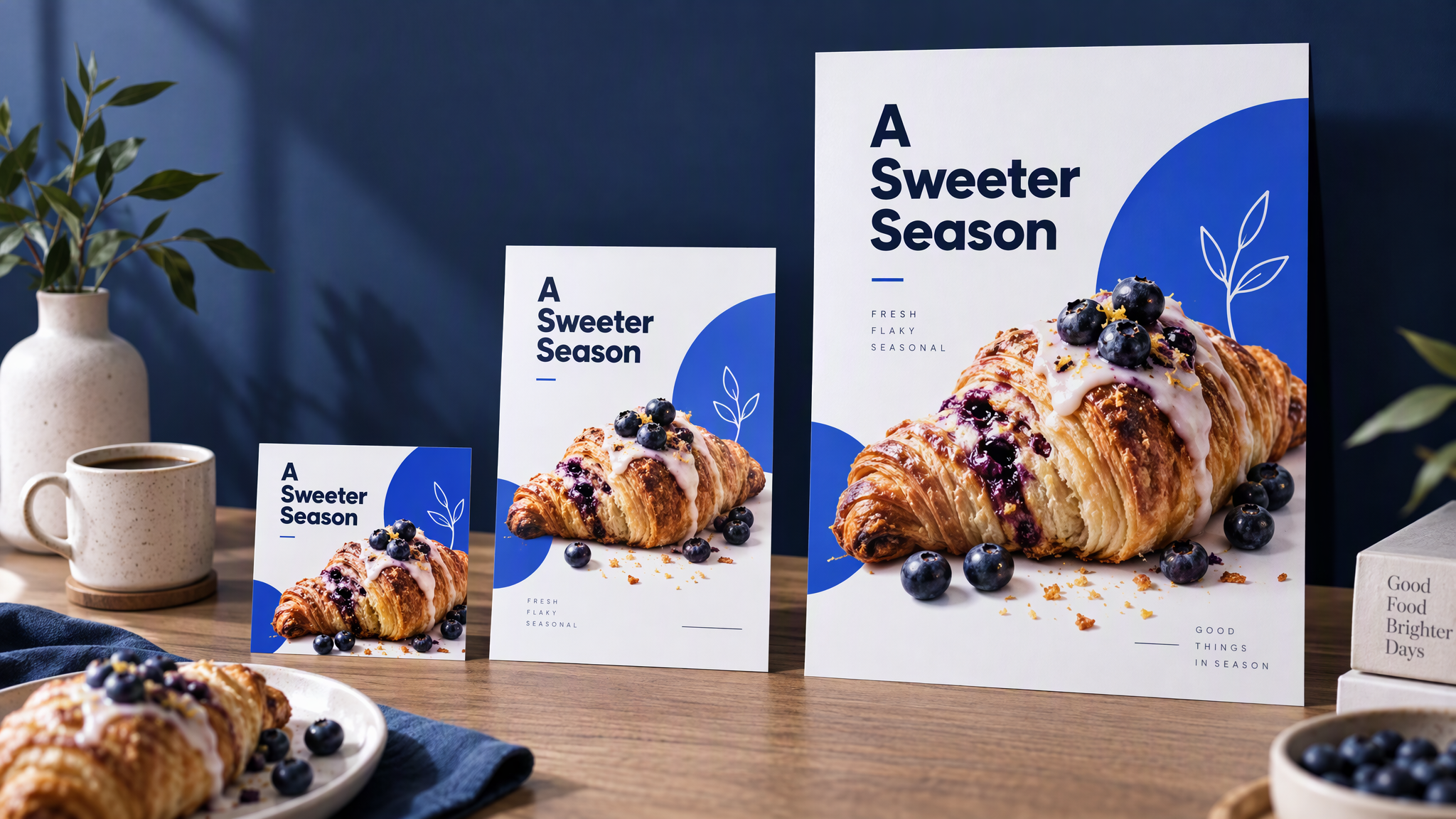
Build the seasonal special once, then resize it. Do not design an Instagram square, an A5 flyer, and an A4 window poster as three efforts that each "feel autumnal".
The master holds the logo, the colours, the type, the photo of the special, and the few words that matter: the name of the item and the fact it is seasonal. From that file you make the square, the A5 for the counter, and the A4 for the window. Paper size changes. The shop does not.
Why a fresh treatment per size causes drift is already in How to Resize One Campaign Asset for Every Channel Without Drift. Use that guide for the crops. The print-specific addition is the next section: the file has to survive a cutter.
Approve the square beside your last few posts, then make the A5 and the A4 from the same master. If the poster cannot hold a long description, cut the words. Do not restyle the brand to make a paragraph fit. A later special should use the same kit, not a new template because the first run feels like last month.
Make it printable from the start
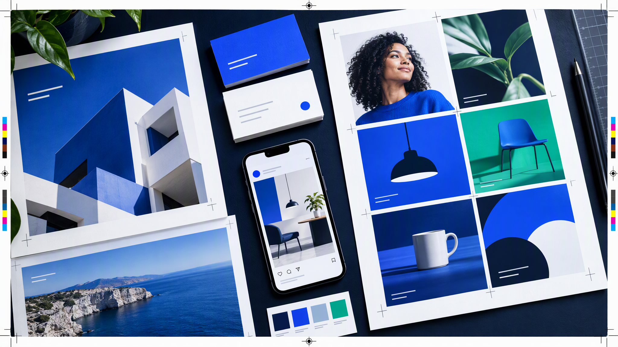
A file that looks finished on a laptop can come back with a white hairline, a cropped logo, or type cut off by the trim.
Full-bleed. Background colour and photography should run past the edge of the finished sheet, so a small shift at the cutter does not leave a white border.
High resolution. A grid export is often too small for A4. Start from a file sized for the largest piece, then make the smaller crops.
Keep prices and the logo off the trim. They need a margin inside the cut. Layouts that kiss the edge lose the price.
Ask the printer for the bleed size before you design. Shops do not share one magic number. A three-millimetre bleed is common and not universal. Get their figure, their file type, and whether they want crop marks.
If you are producing the file in Brandiseer, Ready Format for printable, full-bleed output is the product note for a print-aimed file instead of a framed mockup. It is optional. Either way, judge the bleed on the file you will send, and ask the printer what they need before the run.
Brief the printer or the helper on one page
Outside help will invent a seasonal look unless the page in front of them forbids it. Send one page, not a folder of other cafés' autumn campaigns.
Attach the kit, two recent Instagram posts you are proud of, and the current menu so names and prices stay accurate. Add one line: same shop, new season. Season lives in the special. It does not live in a new palette or a new photo style.
State the deliverable: one master, then the square, the A5, and the A4, with the printer's bleed already in the file. Ask for that set, not five festive directions. Reject any proof that fails next to the grid.
How Founders Without a Designer Keep Every Post Looking the Same is the digital version of this habit: store the look once and stop rebuilding it per piece. Do not send last year's template as the reference if it looked like a different shop.
A five-minute check before you print
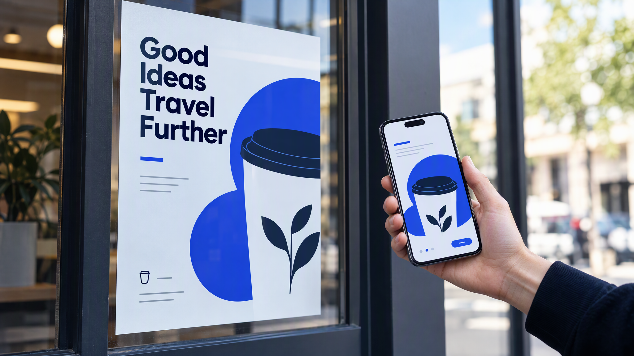
Reprint costs more than the check. Photograph the poster, or hold the proof, next to your phone showing the grid. Pass only if logo, colours, fonts, and photo style still read as one business, and the piece is seasonal only in the special itself. Fail a new palette, a script face, a stock photo, or a logo you would not put on the cup. The same test belongs on the listing people see before the poster, which is covered in Google Business Profile photos that match the shop.
Do the same with the menu and the flyer on the counter. Fix it before the stack is printed. Later winter specials should come from the approved master.
More notes in this cluster sit under Social posts.
A shared kit and that phone-next-to-the-poster check are enough for most local shops. If you want the square and the print sizes to start from the same saved look, Brandiseer can hold the kit. It is optional. The side-by-side with your grid is the point.
FAQ
Can we start from the printer's menu template if we drop our logo in?
The logo helps and usually is not enough. Template type, borders, and colours still read as the gallery. Start from your kit, or strip the template until only your logo, colours, fonts, and photo remain.
Do the menu and the flyer have to use the same photo?
They have to use the same photo style. The special can be a new shot if it was lit like the grid. A new style for the window is a new shop.
What if we only have a phone camera?
Use it the way you already post. A straight photo of the real special, in your colours, beats a stock image that looks expensive and unfamiliar.
Is a full-bleed file only for large runs?
No. A short run of flyers still shows a white hairline if the background stops at the trim. Ask for the bleed size even when you are printing dozens.
Same shop on the glass and on the phone
Printed menus and flyers drift when a template, a late file, or a helpful friend rebuilds the look from scratch. Keep logo, colours, fonts, and photo style tied to the Instagram grid. Design the special once, then make the square, the flyer, and the poster from that file, with the printer's bleed sorted before you approve. If the phone and the proof do not look like one business, do not print.
The season can change the special. It should not change the shop people already follow. When a national campaign hands you a poster, Small Business Saturday posts that match your shop keeps the official pack and your own photos in the same feed.